Drawing attention to your brand and keeping it isn’t easy, especially when the audience is scrolling through browsers faster than you can say “professional design services.” Speaking of professional design, did you know that most people don’t stick around a webpage for more than 54 seconds?
If you want your audience to stick around and leave after making a purchase, you must provide them with incentives and interaction. No matter how trends might’ve changed, engagement is the one thing that remains constant.
It also happens to be the one thing encouraging The NetMen Corp to pursue the following industry trends.
1. Scrolling Animation
You may or may not have to use JavaScript to create scroll animation or effects. These micro animations draw the user’s attention as they scroll down the webpage. Particularly helpful in retaining traffic for longer webpages, scroll animations:
- Encourage the user to keep scrolling.
- Indicate a break in content.
- Enhance interaction through 3D visuals.
You can use scroll effects to your advantage on a portfolio website. Suppose you run an interior decoration business. In that case, you can use the scroll effect to draw the user to your work, which would be in animation form.
2. Think Out of the Grid
Most web content is displayed in grid form, with the image occupying one spot and the text occupying the other. The two don’t always overlap because the result can be distracting, which is where professional web designers come in.
Broken grid layouts are becoming increasingly popular this year because they allow you lots of negative space and convey your message. The trick to blurring the lines: let the image and text overlap so that even someone who’s colorblind can read it easily.
3. Larger Typography
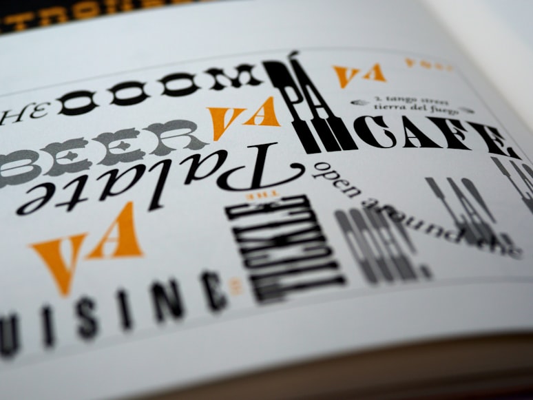
Typography is the text-based content on your website when it’s small and simple. When you enlarge this text, it’s as much a part of your visual landscape as your images. Some web designers have started emboldening text and changing its font to look like an image.
Not only that, but they’ve also started using two colors for the text to make it legible against the background illustration or animation and make the reader curious enough to want to check out the imagery your big, bold text appears to conceal.
4. Gender-Neutral Vibes
Gender-neutral designs were big last year, increased in popularity in the ongoing year, and are only set to go bigger in the future. While the vibe used to be optional, it’s increasingly becoming the norm for the stereotype-defying generation of business owners.
A common example of eCommerce websites going gender-neutral is their unwillingness to assign sections labeled ‘men’ or ‘women’ to clothes. Instead, the items are sorted into categories, such as tops, bottoms, seasons, holidays, etc.
Another way to go gender-neutral is by showing items, even those perceived as “hypermasculine” or “hyperfeminine,” on different body types.
5. 3D Web Textures
Web textures add an extra oomph to your website by giving it a 3D illusion. These are background images, but they only like a slightly layered version of your plain or patterned background.
The above distinction is extremely important. While you can manage texture on a patterned background, it would pop way better on a plain background. You can use web texture to create backgrounds inspired by duct tape, cracked ceilings, super-magnified bed sheets, carpets, tiles, and other three-dimensional surfaces.
6. Communicate Through Color
This year is just as much about clean and gender-neutral aesthetics as messy and joyful vibes. You can inspire your website with a colorful abstract painting or use clean yet bold illustrations in colors like yellow, red, indigo, and royal blue for the HERO image(s) in a slider or banner.
If your first image is vibrant and bold, it will give a welcoming impression. Similarly, ending your page with bold illustrations would emit joyful and positive vibes.
7. Thinner Serif Headlines
Before 2021, web developers avoided serif fonts like they were the ultimate bug because there was hardly any support for them, not to mention the limited screen resolution that didn’t allow the fonts to shine. The fonts finally got the spotlight in 2021, albeit in a thicker, bigger, and bolder iteration.
According to the latest Monotype Type Trends Report, things will be different this year. More web designers will experiment with slender serif fonts to create sophisticated headlines, and so should you.
8. Renewed Focus on Essential Features
If the return of old trends applies to website designs, then we’re surely seeing a resurgence of minimalistic designs. Load time and user experience weren’t an option when the internet was still a new concept.
We worked with what we had, which included:
- A white background
- Bold text
- Negative space
- Vibrant background colors
The above aspects made up what we now call the quintessentially minimalistic design. Multiply these by two, and you get ultra-minimalism, a popular industry trend inspired by the first few years of web design. This web design focuses on the features you need, no more and no less. It’s got advantages, too. You don’t have to worry about responsiveness or load time when you have such a simple and clean website.
Apply the Above Trends to Your Website Through Our Design Services in Miami
Try the above industry trends with The NetMen Corp, a company providing custom design services in Miami for the past 20 years. Recruit our digital illustration services for your existing website or start from scratch with our custom web designers. Check out our templates and designs if you’re looking for ready-to-buy solutions.
Contact us for further assistance regarding white label design services in Miami.


