PHONE: 1-888-519-3443
PHONE: 1-888-519-3443
As an owner or employee of a small business, you have a lot on your plate. While the bigger companies have teams of people to handle all the ins and outs of running a company, you’re often left to juggle the responsibilities of multiple departments on your own.
With that balancing act, it can be easy for certain things, like web or graphic design, to be left behind. After all, you may think these are superficial concerns — the icing on the cake, as it were. But don’t be so quick to discount the importance of graphic design in business. The image of your company that you present to the world matters in many ways.
The quality of your company’s designs influences not only who’s going to buy from you, but also what the average customer is going to think about your brand. Need more convincing? Here’s an in-depth look at the importance of graphic design for small businesses.

Perhaps you’ve heard you only have a few seconds — seven to be precise — to make a good impression. If you go up to someone with a huge frown on your face, a ketchup stain on your shirt and a piece of spinach between your teeth, they are more likely to turn and run the other way than shake your hand. But if you approach with a smile and clean shirt, they’re likely to think, “Here’s a friendly person worth getting to know.”
First impressions matter when it comes to introducing your business or brand to a new customer. And here’s the thing: You have even less time to impress someone with design or with your website than you do in person. A study out of Carleton University in Ottawa found that it took people just 50 milliseconds to assess the visual appeal of a website.
A website or product that lacks good graphic design is the ketchup-stained shirt of the business world. People might take a quick glance at it, but no one wants to be seen hanging around it.
When it’s done well, graphic design tells an audience or potential customers exactly what your company is, what it does and how it can help them. You don’t even have a full second to get that message across, so it’s important to get all the help you can.
Trust is a pretty big buzzword for brands and businesses these days. It’s not enough to offer your customers a useful product. You also want them to feel that they can trust you. And one of the ways to build trust with a potential customer base or to maintain trust with current customers is through design.
In a small study that gauged how well people trusted the information they found about a medical condition on a website, the way the website looked mattered more to participants than the actual content on the site.
Around 94 percent of the participants stated that particular problems with the design of a website made them click away. Just six percent claimed that actual issues with the content on the website was at issue.
Design is about more than just looks. It also affects people’s ability to use your website or to use your products. Among the design issues that led people not to trust a brand were:
How good your brand looks is going to affect how people perceive it. Even subtle changes to the design of a logo or packaging can be enough to change people’s thinking about the product inside.
You see how image influences perception frequently in real life. For example, if a person gets a neat haircut, trims and polishes his or her nails and puts on a well-tailored suit made of expensive looking fabric, you’re going to perceive that person as well off. He or she most likely has a high-paying, powerful job.
Why do you think that? Because that person is showing you signs that it is the case. He or she demonstrates the financial ability to buy a nice suit and have it custom fit. He or she has the means to get a decent haircut and the ability to afford regular manicures.
Now, let’s say that same person let his or her hair grow out, started biting his or her nails and traded the nice suit for a pair of ripped jeans and a holey T-shirt. It’s the same person, but your idea of him or her has changed. Now you might wonder if he or she is unemployed, going through a rough patch in life or in need of financial assistance.
The same holds true for brands and products. Way back in the 1950s, the marketing innovator and researcher Louis Cheskin examined how people respond to packaging and what factors brands can use to get customers to purchase.
His biggest claim might have been that customers found little difference between the packaging of a product and the actual product. If you included an image of a fresh vegetable or herb on the label of a can of soup or pasta, people with associate the product with fresh food, even though it’s a highly processed can of soup.
Design and packaging can also trick people into thinking they are getting one product when they are getting another. One of Cheskin’s studies involved having people taste test two brands of liquor. When the participants tasted the liquor without knowing the brand names or what the packaging looked like, most thought the drinks tasted the same.
But, when the researchers revealed the brand names to participants, the majority chose the brand with the more well-known and respected brand name, Brand A, as their preferred liquor. To make things more interesting, the researchers then switched the packaging of the liquors. They poured Brand A into Brand B’s bottle and Brand B into Brand A’s bottle.
Based on the packaging, more people went for Brand A when poured from Brand B’s bottle, because the bottle was considerably fancier than Brand A’s bottle. People thought they were drinking Brand B, but preferred it over Brand A based on their perception of the brand from its packaging.
Design doesn’t just alter how people perceive the quality of your brand. It can also change how they perceive the reality of your products. Another one of Cheskin’s studies involved the color of product packaging — in this case, for a well-known brand of lemon-lime soda.
The soda remained the same throughout the study. But when it was poured out of a bottle that was yellow, versus green, people claimed that they detected more lemon flavor in the drink.
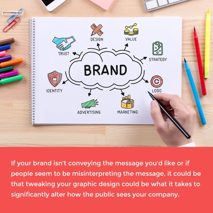
If your brand isn’t conveying the message you’d like or if people seem to be misinterpreting the message, it could be that tweaking your graphic design is what it takes to significantly alter how the public sees your company.
Pepsi. Coke. Nike. Apple. Windows. Close your eyes and think of those brands. What comes to mind? You probably aren’t picturing an Apple or Windows computer, a glass of cola or a pair of sneakers.
No, what comes to mind when you think of established, household brands are their logos. You see the Nike swoosh, Apple’s apple, the flying Window, the white scripted lettering of Coca-Cola.
Logos don’t only help people remember your company’s name or existence. They also help people remember particular attributes about your business. A study of 3,000 residents in the U.K. and U.S. found that people tended to associate geometric logos with power, logos with a company’s initials with edginess and serif wordmark logos with respectability. Additionally, memorable logos were 13 percent more likely to get the participants’ attention than generic logos.
The color of your logo or the colors a designer uses in your company’s design also affect how well people remember your brand. Decades of research and studies have looked at how the brain perceives and responds to colors. The use of warm colors, such as yellow and red, draw the eye to a particular aspect of a design and send the signal that anything displayed in that color needs to be remembered.
Cooler colors, like blue and green, are usually used because they are calming. They don’t send the “remember this!” signal, but they are thought to help the mind feel more at ease. Blue, in particular, is thought to help make difficult thoughts and concepts seem simpler. That might explain why blue is the color the majority of people connect with business success.
In business, the customer always needs to come first. If you aren’t listening to or responding to the needs of your customer, your company is going to sink rather than swim.
One way to respond to the needs of your customer is through graphic design. Design isn’t just about making a website or package look good. It’s also about responding to specific needs and helping to solve specific issues.
When something is well designed, it anticipates a person’s needs before they even know it’s a need. Think of your favorite well-designed website. You visit it, you recognize the logo, you click on the page you want right away. It’s like the website is reading your mind and knows what you want before you do.
Now think of a poorly designed website. It doesn’t know what you want or why you’re there. It offers you an ad for shoes in one corner, has a phone number printed in another and there are lots and lots of pictures. You came there looking for something specific, but now you can’t remember what it was and there’s nothing on the site to jog your memory.
Part of being a good graphic designer and offering customers great design is understanding the basics of human psychology. A good designer will know whether a person is going to look to the left or right of the page or product first and will put the most relevant information there. He or she will also know which shapes and colors create the greatest emotional response in people and will work those into a design to create the desired effect.
Think back to your high school English or writing classes. One of the things your teacher might have written on your stories or papers was “show, don’t tell.”
Showing customers things, rather than telling them things, doesn’t just get the point across in a more engaging way. It also helps clarify the situation for them and simplify the process of getting the message to their brains.
For all its complexity, the human brain actually likes to keep things simple. It gets bored and tired when it has to process a lot of information, especially if it has to process that information quickly. Think about instances when you need to perceive a message fast.
You’re driving down the road and come to an intersection. Is there a sign at the start of the intersection telling you there are cars approaching from the opposite direction, so please stop or slow down to avoid hitting them?
Yes, there is, but it’s not using so many words. It’s going to be a big, eight-sided, bright red sign that simply says “STOP.” In some cases, it might be a bright red light that tells you to stop or a bright green light that lets you know it’s OK to keep driving.
Just as well-designed traffic signs simplify and clarify things for drivers, good graphic design for small businesses clarifies things for customers. Most people are visual learners. Around 65 percent of the population finds it easier to process information when it’s presented to them in images or other visualizations.
Even if you’re offering the best thing ever created, if you can’t find a way to simply explain that to your customers or can’t find a way to use eye-catching imagery to convey your point, your business is going to have trouble. Few people are going to know to stop or will be able to stop their cars in time if they have to read several sentences about it first. If people have to put too much effort into understanding what it is you do or offer, they’ll just move on to the next product.
You’re a business person. You understand what graphic can do for your company and how it can help you market your product or service. But what is it going to do for your bottom line?
As it turns out, quite a lot. From a financial point of view, you can’t ignore the impact of graphic design on business.
Design has been shown to boost a company’s financial performance. A tool exists, developed by the Design Management Institute, that tracks the performance and results of “Design Driven Companies.” According to the index, companies that put design first beat the S&P index by 228 percent over the course of a decade.
To translate that into actual dollars and cents, if a person were to invest $10,000 in a design focused company 10 years ago, the value of his or her investment would have increased to nearly $40,000. In contrast, had that person invested the $10,000 in the S&P Index, its value would have grown to just over $17,000 after 10 years.
Design doesn’t only increase a company’s worth. It also boosts business and can provide a massive return on investment. The yogurt brand Chobani provides a great example of a company taking a gamble on design and having that gamble pay off.
Chobani produces Greek yogurt, which is thicker and tarter than the yogurt most people in the U.S. are used to eating. Around 2008, the company wasn’t really bringing in any revenue. Flash forward to 2013, and the company had more than $4 billion in sales and was the third most popular yogurt brand.
What changed? The company’s design. Its CEO decided to spend a quarter of a million dollars on a redesign of the yogurt’s packaging. The result was a shorter, wider yogurt cup and packaging that featured bright colors and crisp images and text. The redesign worked, and the now much more eye-catching yogurt flew off store shelves.
It might seem unfair to say companies that put design first tend to see the greatest growth. But the numbers back up the claim. Thirteen of 2014’s Fortune 125 companies have C-suite positions devoted to design or a CEO who was firmly in favor of being a design-forward brand.
Nike, with its memorable swoosh, is a good example of a successful, rapidly growing design-focused company. In 2013, the brand was ranked as the 24th most valuable brand in the world. From 2012 to 2013, it had moved up two spots on the list and saw a 13 percent boost in value over the course of a year. Over the course of 10 years, from 2003 to 2013, the brand’s market cap grew by more than 1,000 percent — from $6 billion to $70 billion.
Although the biggest brands in the world have invested in great graphic design, that doesn’t mean good design is out of reach for small businesses. The truth is good design often doesn’t have to cost a lot. Sure, Pepsi spent $1 million on its logo redesign. But Coca-Cola’s iconic script cost the brand nothing. Nike’s famous swoosh cost just $35 back in the early 1970s.
Even today, brands can get memorable, affordable designs. The original bird logo used by Twitter cost the social media site just $15. They found the image on a stock photo website.
Just as quality over quantity matters when you’re choosing what to offer your customers, going for quality over quantity matters when you’re looking for someone to provide your business with graphic design services.
If you are ready to see the difference graphic design can make for your business, contact The NetMen Corp to learn more about our affordable design packages today.
