PHONE: 1-888-519-3443


PHONE: 1-888-519-3443
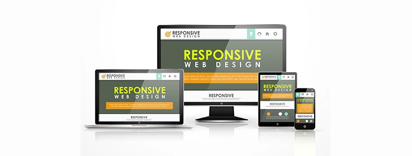
Every day, 93 percent of internet users use a mobile device to browse the web. Since so many people use mobile devices to access the web, you need to have a good mobile site. User experience is important when it comes to converting, but it’s also a factor in how Google ranks your site. Here are some important tips for creating a great mobile web design.

Building a mobile-friendly site comes down to your approach. Overall, you need to optimize your site for mobile devices, since users have a smaller screen and a different experience on mobile than on desktop. One way to do this is by creating a responsive site. With this option, everything stays the same except for your CSS, which changes based on browser width.
There’s also RESS/Adaptive/Dynamic Serving, where you can keep your URL the same but send different HTML and CSS based on the device that’s accessing the site. The third option is a separate mobile site with the same URL as your desktop site, but with different HTML. No matter which version you choose, it will optimize the content around a phone screen rather than a desktop.

There are a variety of factors that make a good mobile site. It starts with navigation because mobile device users are often goal-oriented and tend to search for the quickest way to get to what they need. You should keep your calls to action near the front, where visitors can easily find them. Since there’s not as much space on a mobile device, use a “hamburger” navigation or another type of drop-down menu to keep the space uncluttered.
It’s also important to keep your site searches both prominent and relevant. Many people expect to find the site search in the top right corner of a site. Keep it there or somewhere else along the top navigation bar to help guide individuals in searching your content or products. Those searches should also be relevant to what the visitor is looking for.Good mobile web design allows for quick navigation and accurate searches.
There are many tips for great mobile web design, but the biggest best practice is to make sure it’s easy for your visitors to convert. You don’t want them to come to your site, read an article, and click off without buying anything or requesting more information. Keep your forms simple and employ an auto-fill feature to save visitors time.
Another mobile web design best practice is letting your visitors check-out as guests. It’s often difficult to purchase products on a phone, and it’s even more complex when they have to create an account to place an order.
If you’re struggling to create a mobile site that optimizes your users’ experience and leads to conversions, contact The NetMen Corp today. We specialize in web design and providing sites that fit your brand and vision.

Lorem ipsum dolor sit amet, consectetur adipiscing elit. Etiam aliquam iaculis purus eu facilisis. Quisque sit amet nunc non ipsum dapibus porttitor.

Lorem ipsum dolor sit amet, consectetur adipiscing elit. Etiam aliquam iaculis purus eu facilisis. Quisque sit amet nunc non ipsum dapibus porttitor.

Lorem ipsum dolor sit amet, consectetur adipiscing elit. Etiam aliquam iaculis purus eu facilisis. Quisque sit amet nunc non ipsum dapibus porttitor.