PHONE: 1-888-519-3443
PHONE: 1-888-519-3443
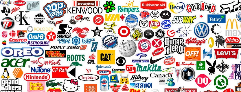
The most iconic logos of all time include Apple, Nike, McDonald’s, Coca-Cola, FedEx, Mercedes-Benz, Starbucks, Amazon, Disney, and Shell. These famous logos work because they are simple, memorable, flexible, and strongly connected to the brand experience behind them.
Great logos are not just attractive symbols. They help people recognize a company instantly, remember it faster, and attach meaning to the brand over time. That is why the best logos often become cultural shorthand for quality, speed, taste, trust, innovation, or status.
An iconic logo is easy to recognize, easy to reproduce, and meaningful enough to stay relevant for years. The design should work in black and white, at small sizes, on packaging, websites, social media, signage, and merchandise. Most importantly, it should match what the brand actually promises.
If you ask people to list the most iconic logos, many would come up with similar lists. We created a list of some of the most iconic logos of all time. Whether you love, hate or are indifferent to these brands, the success and fame attributed to their logos is undeniable.
The manufacturer of computers and handheld devices is proof that a company doesn’t have to be century old to have an iconic logo. Apple Computer was founded in 1976 and renamed Apple, Inc. in 1977. Logo designer Rob Janoff created the apple with a bite missing and a single leaf that year. The original version had horizontal rainbow-colored stripes. The apple has undergone various changes with regard to color and shading throughout the company’s four decades, but the shape has remained identical. The success of this logo can probably be attributed to the success of the products, all of which bear the design. Unlike some of our iconic logos, which have remained unchanged, Apple is currently on the fifth version of its logo
design.
Every auto manufacturer has a logo and most of them have been around for decades, but the Mercedes logo, or some version of it, has been around for about a hundred years. Mercedes-Benz was the offshoot of Daimler-Motoren-Gesellshaft. The first automobiles marketed as Mercedes-Benz were introduced to the market in 1926, but origins of the three-point star logo predate the name. The three-point star first appeared in 1909 on Daimler cars, but the iconic symbol eventually migrated to Mercedes-Benz. This logo has become synonymous with quality and luxury and can be seen on every M-B vehicle produced by the German auto manufacturer.
Many companies design successful logos that contain their name. From a marketing perspective, it’s the best of both worlds. Customers instantly recognize your brand and either read or, better yet, don’t have to read the name. Coca-Cola is more than one of the most successful brands in the world. It also has one of the most famous logos of all time. The product was developed by a pharmacist in Atlanta in 1886, but the current cursive logo with the twisted band underneath it on a field of red evolved over the following hundred years. In addition to Coca-Cola’s logo being on every can, bottle, and machine dispenser that contains its product, most restaurants that serve Coke products proudly display the logo on menus or signs.
Anyone who was born prior to 1970 can remember the music video revolution that coincided with the 1981 launch of Music Television, otherwise known as MTV. The MTV logo, which was splashed on the screen between videos and is now in the corner of the TV during shows, is unique in that it was designed with the idea that it could be frequently changed. The blocky M and the smaller TV followed a consistent font and proportions, but the colors and patterns were frequently changed and often animated. In 2008, MTV opted for a more subdued and consistent version of their loud, in-your-face logo, but few early fans will forget the astronaut planting the MTV flag on the moon.
You would assume that the most popular webpage in the world would also have the most popular logo, but what makes Google interesting is how often it uses wild variations of its standard logo, which is the word “Google” in green, red, yellow and blue. The company was founded in 1996 by Larry Page and Sergy Brin, and has since become the largest search engine in the world. Part of Google’s success can be attributed to the catchiness of the name, the simplicity of the site, and, of course, the fame of its corporate logo.
When Carolyn Davidson designed the Nike swoosh in 1971, she received $35 and 500 shares of company stock, which appreciated to hundreds of thousands of dollars in compensation. Company cofounder Philip Knight wasn’t impressed with the simple design, but grudgingly approved its use. The name Nike was derived from the Greek goddess of victory and Davidson felt that the swoosh represented speed and motion. In addition to custom designing footwear and uniforms for basketball players, tennis stars, golfers and more, Nike’s logo can be seen on the uniforms for the NFL and the NBA. Nike also created the jumpman logo, which is a silhouette of basketball legend Michael Jordan performing his signature aerial slam-dunk. One company with two iconic logos — that’s an enviable position.
With restaurants in 119 countries, few people in the world aren’t familiar with the most prolific restaurant chain in history. Early McDonald’s restaurants had a slanted roof with a yellow arch on either side. When viewed at a certain angle, the two arches vaguely resembled a letter M, the first initial of the restaurant name. When Ray Krok purchased McDonald’s in 1961, company President Fred Turner and Executive Jim Schindler created the early version of the golden arches on a red background, which we’re familiar with today.
You’ve seen the Starbucks’ emblem adorning cups, coffee bags and canned and bottled retail beverages everywhere. The crowned woman in the center of the logo is a twin-tailed siren, which in mythology was a womanly creature who used her voice to lure ships onto the rocks. When one considers coffee’s hold on society, the symbol of the siren makes a powerful point. The original logo, which came into existence around 1971, originally depicted a more full-bodied siren and the company name was printed in a green ring. In 1992, the company opted to crop the siren, making the image a little more conservative. It’s also dropped the company name from the iconic logo.
Large-scale Hollywood movie studios have a tremendous advantage when it comes to promoting their logos: they can, and do, display them at the beginning and end of the film. When Warner Brothers first formed in 1918, movies were one of the very few non-print forms of advertising in existence. The original shield design was a photo of the movie studio over the letters WB. From 1937 – 1948, during the “Golden Age of Hollywood,” Warner Brothers adopted a large WB contouring to the shape of the shield. While the studio went through acquisitions and mergers over the next several decades, it occasionally strayed from the classic logo but remained familiar.
One of the most well-known logos in the energy industry doesn’t belong to the largest. As of 2016, Royal Dutch Shell (Shell’s parent company) only ranked thirtieth among all energy companies. So, why is the yellow shell logo so iconic? Perhaps due to consistency. When the company was founded in 1907, its logo was a black and white shell that appeared to be lying on the ground. In 1948, it was changed to the yellow and red scallop that has persisted in some form until the present. Consistency can be a powerful element in a logo’s success.
The entertainment goliath has had many official logos including the word Disney written in founder Walt Disney’s distinctive cursive handwriting, either alone or beneath an image or silhouette of a castle. However, the company is best known for its distinctive and simple logo: the three-circle silhouette that looks remarkably like Mickey Mouse’s large-eared head. Disney, of course, recognizes the value of its excellent logo. In 2014, it entered a legal battle with Canadian DJ Deadmau5 because his logo was too similar to their three-circle mouse.
Uber has earned its way onto this list by its own right. The taxi-alternative company has fought its way through legislation, lawsuits and political strife and somehow manages to endure. Although it’s a new company, Uber has been through one major logo change. Initially, Uber used a boxy letter U, but last year it changed it to a circle with a square in it. Uber explains that the new logo is a reflection of how they see themselves as a futuristic company. The new logo represents both an atom and a bit of data. Whether or not the logo will become iconic remains to be seen, but with 50,000 drivers added monthly, it’s likely that it will be one for the ages.
In 1971, two Americans wanted an American burger in London, so they started the legendary chain of restaurants and casinos. Artist Alan Aldridge gained fame through his work for the Beatles, and then designed the legendary Hard Rock logo. As the chain grew from one major city to the next, it began selling white t-shirts with the logo displayed at the center of the chest. The shirts became a popular trophy for vacationers visiting the various travel destinations. Merchandising has become a substantial part of the Hard Rock empire, and now, in addition to shirts, it can be found on pins, buttons, drinking glasses, leather jackets and key chains.
The discount retailer’s original logo was created in 1962 and used twice as many rings as the modern three-circle target symbol. In 1969, Target created a print ad with a woman wearing an earring that resembles the modern three-circle target logo, and this was the first time that the company used that model of the logo. In 2006, Target decided that the three-circle red and white symbol could stand on its own without the company name appearing, too. Target claims that 96% of Americans know what the target symbol means without any additional information.
One of the most iconic products that America has ever produced is the 140-year-old beer brand created by German immigrant Adolphus Busch. While the logo has undergone a few minor changes, the key elements have remained consistent: a red slanted bowtie background, the word Budweiser written in script and a crown indicating that it’s the king of beers. Budweiser sells volumes of beer around the world and markets its logo on neon and plastic signs and posters, and in bars and restaurants, and on the walls of sporting venues.
Founded in 1971 as Federal Express, FedEx introduced its current logo in 1994 during a rebranding effort. Designed by Lindon Leader of Landor Associates, the logo appears simple at first glance – just the company name in bold, sans-serif letters.
However, it contains a clever hidden element: the negative space between the ‘E’ and ‘x’ forms a perfect arrow pointing to the right. This subtle arrow symbolizes speed, precision, and forward movement, qualities FedEx aims to embody.
Many people don’t notice the arrow at first, but once seen, it becomes impossible to unsee, creating a memorable “aha” moment. The logo’s color scheme varies slightly depending on the specific FedEx service – purple and orange for the main brand, green for ground shipping, red for freight, and blue for express services.
The FedEx logo has won numerous design awards and is consistently ranked as one of the best logos of all time by design experts, demonstrating how simplicity and clever design can create an iconic brand image.
In 1995, the Cincinnati-based consumer products manufacturer decided to change one of the most iconic logos in the history of branding to a nondescript P&G in a circle of blue. Why would a company with a 145-year history suddenly scrap its readily identifiable logo and start over? Proctor & Gambles old logo was a circle, which contained a man in the moon. Some observers analyzing the image claimed that squiggly lines in the character’s beard looked like the number 666, which is commonly linked to Satanism. In addition, the points of the quarter moon appeared to be horns, which accusers suggested also represented the devil.
The false rumors of P&G’s satanic ties appear to have originated in the 1980s and were bolstered by additional claims that the CEO was donating to the Church of Satan. None of these rumors were substantiated or supported by any evidence. When Amway tried to reignite the Satanism rumors, Procter & Gamble was awarded $19.25 million in a civil suit. Unfortunately for the company, the damage to the logo seemed irreparable.
There’s no indication that complicated or particularly clever logos are more marketable or recognizable than simple ones that use only the company name. In contrast to Budweiser’s king of beers logo, the single red star of competitor Heineken is also among the most iconic logos of all time. The Chevy bowtie is every bit as famous as Mercedes-Benz’s three-point star in many markets.
Placement is a significant factor in the success of a logo. A logo positioned correctly on products, packaging, clothing, vehicles and advertisements can increase its chances of becoming iconic. Another obvious contributing factor to a logo’s fame is attaching it to a wildly popular product, which can lead to the enviable problem of having to decide whether the logo sold the product or the product sold the logo.
As a logo design and branding company, that’s an argument that we’ll grudgingly concede.
The famous logos above earned their status over decades. But the last three years have produced some of the most discussed rebrands in modern brand history, and a few of them are already changing how designers think about what an "iconic" logo can look like. Here are the most consequential rebrands we have watched at The NetMen Corp through 2026.
In July 2023 Elon Musk replaced the blue bird with a stark, white-on-black X. It was the most controversial brand swap of the decade: a beloved trade dress with 17 years of global recognition was discarded overnight for a single Unicode glyph. The lesson for designers is that legacy equity is real, measurable, and very expensive to walk away from. Two years in, third-party usage metrics still show many users and journalists referring to the platform as "X (formerly Twitter)," which proves that you cannot simply legislate recognition.
Meta's text app launched in July 2023 with a clever serif "@" mark twisted into a thread shape. It is one of the few modern logos that reads cleanly as a single glyph at favicon size, scales to billboard size without modification, and signals the product category (text, conversation, threading) in one form. Threads is a textbook case of resolution-aware design: the mark was tested across favicons, app icons, and animated splash screens before the brand identity was finalized.
Jaguar's late-2024 rebrand stripped away the famous leaping cat, replaced its wordmark with a geometric monogram, and traded the heritage British racing green for hot pink and saturated yellow. The reception was openly hostile across automotive media, but Jaguar's leadership has been clear that the rebrand is part of an electric-only repositioning aimed at a younger luxury buyer. Whether the new identity holds or quietly retreats, it is now the canonical example designers cite when debating whether a heritage brand should be allowed to break with its visual past.
Pepsi returned to its 1990s color palette in late 2023, restoring black to the wordmark and refining the globe with sharper geometry. It is a quietly excellent rebrand because it actually does what most rebrands fail to do: it ties the present to a moment of peak cultural relevance for the brand without looking like a nostalgia exercise. The new mark animates well, prints clearly on cans, and reads cleanly in low-resolution social formats.
OpenAI refined its hexagonal "blossom" mark in 2025, simplifying the geometry, tightening the optical balance, and introducing a more flexible wordmark. The brand is still very young, but it is one of the rare cases where a logo built for a research lab has had to grow into a consumer brand running on hundreds of millions of weekly users. The current mark works because it remains distinct at tiny app-icon sizes and stays neutral enough not to compete with the language interface that is the real product.
Airbnb has not touched the 2014 "Belo" symbol in any meaningful way, but the brand system around it has been refined repeatedly through 2024 and 2025: tighter typography, a warmer photographic palette, and a more confident relationship between the symbol and the marketing system. It is a useful reminder that the most successful logos are rarely the ones that change the most; they are the ones that get a disciplined supporting system around them.
Three patterns stand out in the 2024-2026 wave of high-profile rebrands. First, the brands that retreated to a simpler, single-glyph mark (X, Threads) are designing for the resolution environment where most logos now live: a 1024 by 1024 pixel app icon and a 16 by 16 pixel favicon. Second, brands that moved away from a beloved symbol (Jaguar, and to a lesser extent Twitter to X) paid a real recognition tax that is still visible in search and social metrics two years later. Third, brands that refined rather than replaced (Pepsi, Airbnb, OpenAI) have gotten the most upside with the least audience backlash.
By repeated public-recall studies the Coca-Cola script, the McDonald's golden arches, and the Apple silhouette consistently rank in the top three globally. The exact order varies by methodology, but those three appear in almost every credible recognition study going back to the 1990s.
An iconic logo carries meaning that the audience has built up over years of exposure to a consistent brand experience. A well-designed logo is technically excellent but has not yet earned that cultural shorthand. Iconic status is a function of time, distribution, and consistency, not just craft.
Refinements every five to seven years are healthy. Wholesale redesigns are rarely needed if the original mark was strong. The brands with the most enduring logos (Coca-Cola, Mercedes-Benz, Shell) have all evolved their marks in small steps over decades rather than reinventing them.
Minimalism scales well to small screens, but a logo's job is recognition, not minimalism. The Coca-Cola script and the Starbucks siren are not minimalist, and they are two of the most recognizable marks ever made. The right level of complexity depends on the brand, the category, and the surfaces the mark will live on.
An emerging brand cannot manufacture instant recognition, but it can absolutely lay the foundations that allow a logo to become iconic over time: a distinctive mark, a disciplined brand system, and consistent application across every touchpoint. The most iconic logos in this guide all started as the visual identity of small companies before they became cultural shorthand. If you are starting on that path, our team builds custom logo design and brand identity systems for businesses at every stage. You can also read our breakdown of 45 rules for creating a great logo design, our take on the logo design trends shaping 2025 and beyond, and our companion piece on 10 common mistakes in logo design.
This guide is reviewed and updated by The NetMen Corp brand team. Last updated May 2026 with the most consequential rebrands of the 2024-2026 cycle.
The NetMen Corp creates custom logo design and brand identity systems for startups, small businesses, and established brands. Explore our logo design services or contact us to start your logo project.
Lorem ipsum dolor sit amet, consectetur adipiscing elit. Etiam aliquam iaculis purus eu facilisis. Quisque sit amet nunc non ipsum dapibus porttitor.
Lorem ipsum dolor sit amet, consectetur adipiscing elit. Etiam aliquam iaculis purus eu facilisis. Quisque sit amet nunc non ipsum dapibus porttitor.
Lorem ipsum dolor sit amet, consectetur adipiscing elit. Etiam aliquam iaculis purus eu facilisis. Quisque sit amet nunc non ipsum dapibus porttitor.