PHONE: 1-888-519-3443
PHONE: 1-888-519-3443
Stationery design is the visual system applied to everyday business materials—business cards, letterheads, envelopes, folders, and more—so every printed touchpoint looks unmistakably like your brand. Done right, it turns routine communication into a trust signal that works before a single word is read.
Stationery design is the coordinated visual system behind every printed piece your business hands out, mails, or leaves behind. It governs your letterhead, business cards, envelopes, invoices, compliment slips, folders, and notepads, treating them not as separate items but as one family. The goal is recognition: when a client receives your letter and later your invoice, both should feel unmistakably from the same company, even before they read a word.
That consistency comes from a fixed set of decisions applied across every piece. The same logo placement, the same two or three brand colors, the same typeface hierarchy, the same margins and grid. A stationery system locks these choices down so a business card printed today matches an envelope printed two years from now. It removes guesswork from anyone producing your materials, whether that is your printer, your assistant, or a designer who has never seen your earlier work.
Stationery is often the most physical, most frequent touchpoint a brand has. People hold your business card, sign your contract, open your envelope. Each of those moments either reinforces a single coherent identity or quietly undermines it with mismatched fonts and off-brand color. Well-designed stationery signals that a company is established, organized, and attentive to detail, qualities clients read as competence before any conversation begins. For a studio with a 25-year track record, that consistency is not decoration; it is proof of standards. Treat stationery design as the operating system for your printed presence, the rules that keep every tangible thing your business produces speaking with one voice.
A stationery system is the printed face of your brand, and it works only when every piece is designed as one family. That means business cards, letterheads, envelopes, folders, notepads, invoices, and inserts all drawn from the same well: the same logo lockup, the same color values, the same typefaces, the same margins and grid logic. When a client receives a proposal in a branded folder, opens a letterhead inside, and later gets an invoice in the mail, each touchpoint should feel like it came from the same place. Designing these in isolation is how brands end up with a card that uses one blue and a letterhead that uses another.
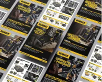
The core set starts with the business card, still the most handled piece you'll produce, and the letterhead, which sets the tone for every formal document. Envelopes carry the brand before anything is even opened, so the return address treatment and any back-flap detail matter. Folders and inserts do the heavy lifting in sales and onboarding, holding proposals, spec sheets, and welcome materials. Notepads and compliment slips handle the quick, informal notes that keep a relationship warm between bigger moments.
Then there are the working documents people forget to brand: invoices, order forms, and packing slips. These get seen at the exact moment money changes hands, which makes them some of the most trust-sensitive pieces in the system. A polished invoice signals that the same care running through your logo runs through your operations too. Designed together, the whole set reinforces a single, coherent identity. Designed piecemeal, it quietly tells clients the brand was assembled rather than built.
Physical stationery still carries weight precisely because it survives the moment. A business card, letterhead, or branded folder is a tangible object someone holds, files, and returns to — long after an email is buried or a banner ad is forgotten. That permanence does work no digital impression can. When a prospect pulls your card from a stack weeks later, the design is still doing its job, reinforcing who you are without a click, a load time, or an algorithm deciding whether you get seen.
There's also a credibility signal that's hard to fake. Investing in well-designed, well-printed materials tells a client you take your own brand seriously — and by extension, that you'll take their work seriously too. Cheap stock, misaligned logos, and inconsistent color read as carelessness. Crisp typography, considered paper weight, and accurate brand color do the opposite: they communicate competence before a word is spoken. For service firms, consultancies, and any business closing deals in person, that first physical handshake with your brand often sets the tone for everything after.
Finally, stationery ties the digital and physical sides of a brand together. The customer who scans a QR code on your packaging, then visits your site, then receives a follow-up letter is experiencing one coherent identity across three touchpoints. When the colors, logo, and voice line up across all of them, recognition compounds — each encounter makes the next one feel familiar. Drop the physical layer and you lose a reinforcement channel that competitors who still print are quietly using to stay memorable.
Stationery is where your brand goes analog, and the four building blocks have to speak the same language whether someone is holding your business card or opening an invoice.
The logo anchors every piece, but stationery rarely gives it the room a website does. Lock down a primary mark and a secondary version for tight spaces, then fix its size and clear space on each format so it never crowds an address line or floats off-center on an envelope. Type does the heavy lifting once the logo is set. Pair a display face for your name with a clean, readable face for body copy and contact details, and hold the hierarchy steady across letterhead, cards, and labels so a recipient reads the same voice every time. Two families, used with discipline, beat six used at random.
Color and layout turn those parts into a system. Commit your palette to exact values: Pantone for print runs, CMYK for offset, hex for anything that lands on screen, so your blue is the same blue on a letterhead and a signature block. Then build a layout grid that travels. Consistent margins, a fixed position for the logo, and a repeated alignment for contact information let a business card, a compliment slip, and a folder feel like one family even at different sizes.
The point is restraint. When logo, type, color, and layout follow the same rules across every piece, each interaction reinforces the last, and your brand reads as deliberate, established, and worth trusting, which is exactly what good stationery is supposed to say before a single word is read.
From a polished business card to a branded envelope, small details signal professionalism and care. Here is what effective stationery actually looks like in practice.
Start with the business card, because it does the most work. A card that builds trust uses a heavier stock, usually 16 to 18 point, with a clean typographic hierarchy: the name and title legible at arm's length, the logo sized to breathe rather than dominate. Specialty finishes earn their cost when they reinforce the brand, not decorate it. A law firm might choose blind embossing and a deep navy edge paint to signal permanence; a design studio might use a soft-touch coating and a single spot of fluorescent ink to signal craft. The texture in the hand is part of the message.
Letterhead and envelopes extend that signal across every document a client receives. A strong letterhead keeps the top third quiet, with the logo, address, and contact details aligned to a clear margin so the actual letter has room to read as a serious communication. The envelope is where many brands get lazy and where attention pays off most. A return address printed in the brand typeface, a logo positioned consistently with the letterhead, and a paper weight that matches the enclosed materials tell the recipient this organization controls its details before they have read a single word.
The thread tying these examples together is consistency. The same color values, the same font, the same spacing logic on the card, the letter, the envelope, and the invoice make the brand feel like one deliberate system rather than a set of loose files. That coherence is what reads as trust. When every piece agrees, the client stops noticing the design and starts believing the company behind it.
How to Build a Cohesive Stationery Suite
A cohesive stationery suite doesn't start at the printer. It starts with your brand identity, the same one that governs your logo, website, and signage. Before you design a single business card, pull together your core assets: primary and secondary logo lockups, your exact color values in CMYK and Pantone (not just RGB, which won't survive the press), your typographic hierarchy, and any signature graphic elements. These become the rules every piece must follow. When the letterhead, envelope, business card, and invoice all draw from one source, they read as a system rather than a collection of separate jobs.
Apply that system consistently across every touchpoint. Fix the placement and clear space around your logo, then repeat it. Lock your type to one or two faces and use the same point sizes and leading for addresses, names, and body copy throughout the suite. Keep margins and grid alignment identical so a recipient's eye lands in the same place whether they're holding a card or reading a letter. Color is where most suites fall apart: specify Pantone spot colors for press runs and proof them on your actual paper stock, because the same ink reads differently on uncoated versus coated sheets.
The details carry the impression. Choose one paper weight and finish and use it across the suite, so a thank-you note feels like it came from the same studio as the invoice. Decide on consistent finishing touches, whether that's a blind emboss, a foil accent, or a single edge color, and resist adding more. Cohesion comes from restraint and repetition, not variety. Build the rules once, then hold the line on every piece.
Ready for stationery that makes every touchpoint feel like your brand? Explore The NetMen Corp's Stationery Design services and get a cohesive print system built by a 25-year branding studio.
If you want this kind of design system built with senior creative direction, clear deliverables, and production-ready files, explore The NetMen Corp services or get in touch to talk about your next project.