PHONE: 1-888-519-3443











PHONE: 1-888-519-3443
Postcard design rules help make a small printed card clear, readable, mailable, and effective. A strong postcard needs one main message, a clear visual hierarchy, readable type, print-safe margins, correct bleed, a clean mailing area, and a direct call to action.
For marketing postcards, the goal is not to fit everything on the card. The goal is to make the reader understand the offer quickly and know exactly what to do next: call, scan a QR code, visit a landing page, bring in a coupon, or book an appointment.
Before sending a postcard to print or mail, confirm the final size, bleed, safe area, resolution, paper stock, mailing panel, address placement, postage area, and any USPS or local postal requirements. These details prevent printing problems and help the postcard move through the mail correctly.
Before you begin, ask yourself: Why are you creating this postcard? Is it for a sale, a grand opening, or a holiday message? Knowing your goal helps shape the layout, text, and images. When you design post card projects with purpose, your message just clicks and makes more sense.
A purpose-driven design helps guide every choice you make—from the fonts and colors to the copy and images. A postcard made for a summer event should feel sunny and bright, while one for a high-end service should feel sleek and refined. Don’t just make it look pretty—make it meaningful.
Postcards come in standard sizes. The most common are:
Choosing the right size depends on your message and budget. Larger cards get more attention, but they may cost more to print and mail. A graphic designer Miami team can help you pick the best option for your goals.
Think about where your postcard will go—on a counter, bulletin board, or handed out. Choose a size that fits the setting.
Simplicity is key in postcard graphic design. Don’t crowd the card with too much text or too many images. Use clear sections:
White space is your friend. It helps make the content easier to read.
Your layout should guide the reader’s eye naturally. Keep your most important message at the top or center. Use grid lines to align elements cleanly. The easier your postcard is to read, the more likely people are to check it out.
Your fonts should be easy to read at a glance. Stick to 1-2 font styles per design. Use bold fonts for headlines and a clean, readable font for the body. Stay away from scripts or overly decorative fonts unless they fit your brand.
Not sure what works best? Chat with a Miami branding agency to get some pro tips.
Also, make sure your font sizes work well for both close-up and distant viewing. Test your design on different screens and print samples when possible.
An eye-catching image or graphic will draw attention. It should relate to your message. For example, if you’re advertising a beach event, show vibrant beach scenes. Your images should be high resolution to avoid pixelation during printing.
Need ideas? Browse graphic design postcards online or visit our portfolio for postcard inspiration.
If you use stock photos, choose ones that feel authentic. Generic images can make your postcard feel flat. A professional photo shoot might be worth the investment for a truly custom look.
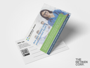
Every postcard should reflect your brand. Use your logo, brand colors, and consistent style. This builds trust and recognition. If you need help staying on-brand, an experienced graphic designer Miami team like ours can help.
Think of your postcard as an extension of your website, packaging, and social media. It should feel like it belongs with everything else your audience sees. That consistency strengthens your overall image.
Tell the reader what to do next:
Place the CTA where it’s easy to see. Make it short and actionable.
Make sure your CTA fits the goal and includes key info like a link or promo code.
If you’re mailing your postcard, follow USPS rules. Leave space for the address, barcode, and stamp. Don’t put text too close to the edges. Many designers forget this and end up redoing the layout.
We know the ins and outs of mailing design. That’s why clients come to us for affordable graphic design services that get results.
Also, check postage rates before choosing a postcard size. Some dimensions may bump your card into a higher rate. Design smart to stay on budget.
Your postcard should feel as good as it looks. Use quality cardstock and finishes like gloss or matte. Good printing makes your design stand out. Cheap prints can ruin even the best designs.
We team up with top printers to make sure your postcards stand out.
Consider special finishes like foil stamping, embossing, or spot UV for an extra touch. These can add sophistication and grab attention without overwhelming your design.
Check your spelling, contact details, and layout. Get a second set of eyes to look it over. Once it goes to print, it’s hard to fix mistakes.
We check your design as part of our affordable graphic design services, so you can avoid expensive mistakes.
Also make sure links, QR codes, and promo codes work as expected. A quick test now can save time and money later.
Send a small batch first and see how it performs. Track responses if you include a code or landing page. Learn from the results and improve the next version.
Smart businesses treat graphic design postcards as part of a long-term marketing strategy.
Try A/B testing with different headlines or visuals. Even small changes can boost your results. Data-driven design is a smart way to grow your reach.
Now that you know the rules for how to design a postcard, you can start creating with confidence. Whether you’re designing it yourself or working with a professional, stick to these tips for success. Great postcards designs combine clear messages, strong visuals, and clean layout.
Postcards are more than paper—they’re a chance to connect, inform, and inspire. Keep your message focused, your visuals strong, and your layout clean.
Looking for assistance? Our graphic designer Miami team at our Miami branding agency is ready to bring your ideas to life. We offer fast, affordable graphic design services that work for any business size.
The NetMen Corp designs postcards, flyers, brochures, door hangers, and print-ready marketing materials for businesses. Explore our print design services or contact us to start your postcard project.
The front of a postcard sells the offer. The back gets it delivered. That is why mailing requirements belong in the design file from the start, not in a last-minute check. A marketing postcard needs a defined mailing panel with room for the address block, postage, barcode, and postal markings. If the layout treats the entire back as usable space, artwork and copy will collide with those elements once the card enters the mail stream.
Plan the back in two zones. The address side holds the mailing information; the message side carries the headline, supporting copy, and call to action. Keep type and logos out of the barcode clear zone and away from the trim edge, the same way you protect the front safe area. Address placement should be consistent across every card in a run so a mail house can process them without adjusting the design.
This is also where postcard design requirements intersect with size. Standard sizes such as 4" x 6", 5" x 7", and 6" x 9" each leave a different amount of room on the mailing panel. A larger card may give you more space for the address block and postal markings, while a smaller card demands tighter discipline. Confirm the final size, bleed, safe area, resolution, and paper stock alongside the mailing panel before printing, and check any USPS or local postal requirements that apply to your format. A clean mailing panel is not decoration—it is what lets the design reach the mailbox intact.
Most postcard guidance focuses on trim, bleed, and safe margins, but there is a separate set of requirements that applies specifically to the mailing side of the card. USPS and local postal requirements govern where the address, postage, barcode, and postal markings sit, and those elements need room to function. The barcode area, in particular, requires clear space and contrast: if artwork, a dark background, or a busy pattern runs through it, the barcode may not scan cleanly, and the card can be delayed or returned.
The practical fix is to treat the mailing panel as a functional zone rather than a design surface. Keep the address block, postage area, and barcode clear space free of imagery, textures, and heavy ink coverage. Leave the background light behind the address so the printed characters stay legible. If your brand palette is dark, invert the mailing panel to a light field instead of forcing the address onto a saturated color.
This is one of the postcard design requirements most designers miss because it never appears on the front of the card. Confirm the final size, bleed, safe area, resolution, paper stock, mailing panel, address placement, postage area, and any USPS or local postal requirements before printing. A clean mailing panel does not weaken the design; it keeps the card moving through the mail so the offer on the front actually reaches the reader.
The mailing panel and barcode clear space are the requirements most likely to be caught at the counter, but they are not the only ones worth verifying. Treat postal compliance as a pre-press step rather than an afterthought, and confirm each item against the final artwork file.
Start with the pieces the excerpt names directly: final size, bleed, safe area, resolution, paper stock, mailing panel, address placement, postage area, and any USPS or local postal requirements. Then check the design decisions that support them. Standard postcard sizes—4″ x 6″, 5″ x 7″, and 6″ x 9″—each change how much room remains for the address block, postage, barcode, and postal markings once safe margins are respected. A layout that works at 4″ x 6″ may crowd the mailing side at a larger size, so confirm the address and postage zones against the size you actually chose.
Resolution and paper stock matter here too. A file that looks sharp on screen can soften in print if resolution is too low, and paper stock affects how ink sits on the surface. Keep the mailing side clean and uncluttered, with no important text or imagery near trim edges.
Finally, match the card to its purpose. A sale, grand opening, or holiday message each shapes the layout, text, and images, and that intent should survive the technical checks. Run the checklist once, then review the printed proof before the full run.
Size isn't a style choice you make at the end. It's a design requirement that decides how much copy fits, how large your headline can run, and how much room the mailing panel needs. Standard postcard sizes include 4″ x 6″, 5″ x 7″, and 6″ x 9″. Each one changes the layout math.
A 4″ x 6″ card leaves little space once you subtract bleed, the safe area, the address block, the postage area, and barcode clear space. That makes it a good fit for one offer, one strong visual, and one call to action. A 6″ x 9″ card gives you more room for a headline, supporting copy, and a larger image, but it may cost more to print and mail. Larger cards also need higher-resolution artwork, since the same image stretched across more area shows softness sooner.
Choose the size around where the card will live. A counter card, a bulletin board piece, and a hand-out each sit in a different viewing context, and that context should shape the format before you open a layout file.
Before designing, confirm the final trim size with your printer and check current USPS or local postal requirements for that size. If you are unsure which format suits your message and budget, a graphic designer can help you choose.
Standard postcard sizes—4″ x 6″, 5″ x 7″, and 6″ x 9″—each impose a different copy budget, and the smallest card is where most design plans break down. A 4″ x 6″ postcard cannot carry the same content as a 6″ x 9″ card, so the layout must be written for the size, not resized after the fact. The practical rule: decide the card size first, then write to it.
On a 4″ x 6″ card, the mailing panel consumes the entire back side—address, postage, barcode clear space, and postal markings. That leaves the front for one headline, one supporting line, one visual, and one call to action. Anything more competes with the offer and slows the reader down. A 5″ x 7″ card buys enough room for a short body paragraph or a small set of details. A 6″ x 9″ card can hold a headline, a brief offer description, contact information, and a CTA without crowding—but only if the type stays large enough to scan.
The test is simple: shrink the design to its final trim size and read it at arm's length. If the headline no longer lands in seconds, cut copy rather than shrink type. Keep the one main message intact, move secondary details to a landing page, and let the card do one job well.
Digital files can look perfect on screen while the printed postcard fails at the mailbox. Before approving a proof, check the physical specifications alongside the layout. Paper stock affects how the card feels in hand and how it survives sorting equipment; a heavier stock resists bending, while a lighter one may need extra care for larger sizes. Coating matters too: a glossy finish can deepen image contrast but may make handwriting addresses or coupon stamps difficult, while an uncoated or matte surface accepts pen and adhesive more reliably.
Ink coverage deserves a specific check. Large solid areas and rich blacks can show scuffing or transfer, so review a physical proof rather than trusting a monitor. If the design uses full-bleed color on the mailing panel, confirm that postal markings and the address block remain legible against it. Finishing options such as rounded corners, spot coatings, or die-cut shapes can change the safe area and may affect how the card feeds through postal equipment, so verify that any special treatment stays clear of the barcode and address zones.
Finally, proof the card as a complete object: fold-free, correctly oriented, and readable under ordinary indoor light. A postcard that passes the digital checklist but fails the physical one still costs the same to print and mail. Build a simple sign-off step that confirms stock, coating, ink, and finishing against the mailing requirements before the file leaves your desk.
Print requirements get most of the attention, but a postcard also has to work for readers who are not standing close, not reading in perfect light, or not reading small type easily. Build legibility into the layout rather than fixing it after the proof.
Start with type size and contrast. Body copy should stay in a clean, readable font, with bold type reserved for the headline. Avoid scripts and decorative faces for anything the reader must absorb quickly, since those styles slow scanning at arm’s length. Dark text on a light field, or the reverse, holds up better than mid-tone combinations where the words sink into the background.
Keep the card’s one main message and clear visual hierarchy intact for every reader. A headline that can be understood in seconds helps someone with low vision or a quick glance alike. Pair one strong visual with short supporting copy, and let white space separate headline, body, call to action, and contact information instead of crowding them together.
Then check the physical card. A print sample reveals whether thin strokes fill in, whether reverse type stays open, and whether the address panel remains readable after finishing. Confirm margins, bleed, and the mailing area are protected so trimming and postal markings never clip the message or the CTA. If a QR code is part of the call to action, give it enough quiet space and contrast to scan reliably.
Accessible postcard design is not a separate checklist. It is the same requirement — clarity at a glance — tested against real reading conditions.

Lorem ipsum dolor sit amet, consectetur adipiscing elit. Etiam aliquam iaculis purus eu facilisis. Quisque sit amet nunc non ipsum dapibus porttitor.
Lorem ipsum dolor sit amet, consectetur adipiscing elit. Etiam aliquam iaculis purus eu facilisis. Quisque sit amet nunc non ipsum dapibus porttitor.

Lorem ipsum dolor sit amet, consectetur adipiscing elit. Etiam aliquam iaculis purus eu facilisis. Quisque sit amet nunc non ipsum dapibus porttitor.