PHONE: 1-888-519-3443
PHONE: 1-888-519-3443
Graphic design isn't one discipline—it's seven distinct ones, each built to solve a specific communication problem. Knowing which type your business needs is the difference between scattered visuals and a brand system that actually works.
Brand Identity Design
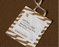
Brand identity design is the discipline of building the visual system that makes a company recognizable across every touchpoint. It starts with the logo, but a logo alone is not an identity. The real work is defining a connected set of assets — primary and secondary marks, a color palette, typography, imagery style, iconography, and layout principles — that hold together whether they appear on a business card, a website header, a delivery truck, or a phone screen. The goal is consistency: a customer should sense the same brand whether they are reading an email or walking past a storefront.
Color and typography do most of the heavy lifting here. A deliberate palette assigns specific values — exact HEX, RGB, and CMYK codes — so the blue on your packaging matches the blue on your app, and typography choices establish hierarchy and personality, from the display face that carries a headline to the workhorse font that keeps body copy readable at small sizes. These choices are not decorative. They encode tone. A bold geometric sans communicates something very different from a classic serif, and that difference shapes how people feel about the brand before they read a single word.
What turns these pieces into a usable system is the brand guidelines document. This is the rulebook that specifies clear space around the logo, minimum sizes, approved color combinations, what not to do, and how the elements behave together. Without it, identity drifts: every designer, vendor, and team member improvises, and the brand slowly loses coherence. Strong brand identity design, the kind we have built for clients over 25 years, anticipates that risk and gives an organization a single, documented source of truth for how it looks and feels everywhere.
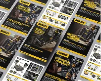
Brochure and print design is where graphic design earns its keep as a sales tool rather than decoration. This discipline covers flyers, catalogs, booklets, brochures, and posters: physical collateral a prospect can hold, flip through, and carry away from a trade show or a counter. The designer's job is to translate a marketing message into a tangible object that guides the eye through a deliberate sequence, from cover hook to product detail to call to action, while respecting the constraints of paper, ink, and fold.
What separates competent print work from amateur layout is fluency in production. A designer working in this field thinks in bleeds, margins, and trim marks, sets files in CMYK rather than RGB, and knows that a tri-fold brochure has six panels that must read in the right order whether the reader opens it left-to-right or unfolds it flat. Paper weight, finish, and binding are design decisions, not afterthoughts. A matte stock signals restraint; a heavy gloss cover signals premium. Typography has to hold up at print resolution and at arm's length, which means tighter hierarchy and more disciplined spacing than a screen forgives.
The strongest print collateral works because it pairs that craft with a clear commercial intent. A catalog organizes a sprawling product line so a buyer can navigate and compare; a poster stops foot traffic with one idea and one image; a booklet earns the few extra minutes of attention that a webpage rarely gets. At The NetMen Corp, this is the design that lives in a customer's hands long after a digital ad has scrolled past, which is exactly why getting the grid, the imagery, and the message right still matters.
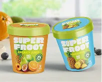
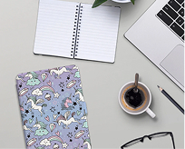
Packaging Design is where graphic design stops being decoration and starts doing a job in the physical world. It covers the boxes, labels, pouches, cartons, and bottles a product ships in—and unlike a poster or a website, it has to survive freezing, stacking, shipping, and a customer's hands before it ever earns a sale. A packaging designer works inside hard constraints: dielines and structural templates, regulatory copy like ingredient panels and barcodes, material limits, and print methods that behave differently on corrugated cardboard than on a glossy label. The discipline sits at the intersection of brand, manufacturing, and merchandising.
On the shelf, packaging is a brand's loudest salesperson. Shoppers scan a crowded aisle in seconds, and the package has to communicate category, quality, and personality before they read a single word. That means designers obsess over the "first second"—color blocking, hierarchy, and a focal point that reads from three feet away. Strong packaging stays recognizable across an entire product line, scales from a travel size to a family pack, and holds up as a thumbnail in an e-commerce grid, where the same artwork now competes as a 200-pixel image instead of a physical object.
Good packaging also protects what's inside and respects how it's made. Designers coordinate with structural engineers and printers to make sure artwork aligns to folds, accommodates seams and varnish, and reproduces accurately on press. Increasingly, the work weighs sustainability too—choosing recyclable substrates, trimming material, and designing for the unboxing moment customers share online. Done right, packaging design turns a commodity into something worth picking up, trusting, and buying again.
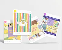
Social media design is brand identity translated into the fast-scroll language of feeds. It covers the templates, post layouts, story frames, carousels, reels covers, and paid ad creative that your audience sees dozens of times a week. The job is not to make one beautiful graphic; it is to build a visual system flexible enough to produce hundreds of posts that still read as unmistakably yours. That means locking down a palette, a type hierarchy, logo placement, and a grid that designers can work inside without reinventing the wheel for every campaign.
The discipline here is consistency under pressure. Platforms each impose their own dimensions and behaviors, so the same announcement might need a square feed post, a vertical story, and a wide ad unit, all sized and cropped correctly without losing the brand's signature look. Good social media design anticipates that by working from master templates and modular components, so a content team can ship daily without diluting the identity. When every touchpoint shares the same color logic and typographic voice, a viewer recognizes your brand before they read a single word, which is exactly the kind of compounding recall that builds trust over months.
Ad creative raises the bar further because it competes directly for attention and budget. Strong paid social design pairs a clear visual hierarchy with a single, obvious message and a call to action that survives a half-second glance. It respects platform safe zones, leaves room for captions and UI overlays, and is built in variations so teams can test what actually drives clicks. Done well, social media design turns a scattered posting habit into a coherent, recognizable presence that reinforces the brand everywhere your audience already spends its time.
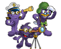
Mascot Design
Mascot design is the discipline of creating an original character that becomes the living face of a brand. Unlike a logo, which is static, a mascot has personality, expression, and the ability to show up in motion, illustration, packaging, and social content. Think of the Michelin Man, the Geico gecko, or Tony the Tiger: these characters carry decades of recognition because they give an abstract company a relatable identity people can picture and remember. A well-built mascot turns a brand from a name into a presence.
What makes mascot design its own type of graphic design is the demand for consistency across infinite contexts. The character needs a defined silhouette, color palette, and set of proportions that hold up whether it's rendered as a tiny app icon or a stadium costume. Designers build out turnarounds, expression sheets, and pose libraries so the mascot stays on-model no matter who draws it next. The work blends illustration, branding, and character development — the mascot must feel approachable and ownable while still aligning with the logo, typography, and overall visual system.
The strategic payoff is emotional connection and instant recognition. Mascots lower the barrier between a company and its audience, especially for brands aimed at families, kids, or markets where warmth and trust drive the decision. They give marketers a flexible asset that works in advertising, mascot animation, and merchandise, and they make a brand easier to recall in a crowded category. When the character is designed with intention rather than as an afterthought, it becomes one of the most durable and valuable pieces of a brand's identity.
Web and digital design is where your brand stops being static and starts performing. This is the discipline behind websites, landing pages, app interfaces, email templates, and the social and ad assets that live entirely on screens. Unlike print, every element here is interactive and measurable: a button, a form, a scroll animation, a load time. The job is not just to look good but to move a visitor toward an action—booking a call, buying a product, subscribing. Good digital design treats aesthetics and conversion as the same problem, not competing ones.
What separates it from the other graphic design types is the constraint set. Designers work within responsive breakpoints, accessibility standards, and performance budgets, so a layout has to hold up on a 13-inch laptop and a phone in one hand. Typography has to stay legible at small sizes, color contrast has to pass WCAG ratios, and image weight has to stay light enough that the page renders fast—because every extra second of load time costs you visitors. This means web designers think in systems: reusable components, design tokens, and grids that a developer can build without guesswork.
It also overlaps heavily with UX. The wireframe, the user flow, and the information hierarchy come before the visual polish, because a beautiful page that buries the call to action still fails. At The NetMen Corp, we treat web and digital design as the front line of your brand: it is usually the first real interaction a customer has with you, and it has to translate 25 years of brand equity into a fast, clear, conversion-ready experience that works the moment someone lands.
Whether you need one piece or a full visual system, The NetMen Corp has built branding across all seven types for 25 years—tell us your goal and we'll match the design to it.
If you want this kind of design system built with senior creative direction, clear deliverables, and production-ready files, explore The NetMen Corp services or get in touch to talk about your next project.