PHONE: 1-888-519-3443
PHONE: 1-888-519-3443
Packaging is your product's first conversation with a buyer, and it usually lasts only a few seconds. Get the core elements right and packaging stops being a container—it becomes a silent salesperson that wins the shelf.
The four pillars of packaging design—visual appeal, brand communication, functionality, and information clarity—each do a distinct job, and a strong package makes all four work in concert.
Visual appeal is what stops a shopper mid-aisle. Color, typography, imagery, and structural shape combine to create an immediate impression, and on a crowded shelf that impression happens in seconds. Strong color contrast and a clear focal point earn the first glance; restraint keeps the design from reading as cluttered or cheap. But attention alone converts no one. That first glance has to resolve into recognition, which is the job of brand communication—the logo, palette, and design language that tell the buyer who made this product and what it stands for. Consistent brand cues build the trust that turns a one-time purchase into a habit, which is why a package should look unmistakably like the brand even before anyone reads the label.
Functionality is the pillar people notice only when it fails. Packaging has to protect the product through shipping and handling, survive the supply chain, and serve the customer once it's home—opening cleanly, resealing, stacking, and increasingly meeting sustainability expectations around recyclable and reduced material. A beautiful box that crushes in transit or frustrates at the kitchen counter undercuts every other element.
Information clarity ties it together at the moment of decision. Product name, key benefits, usage, ingredients, and required regulatory details must be legible and logically ordered so the buyer finds what they need fast. When all four pillars align, the package attracts, explains, protects, and converts—the difference between a product that sits and one that sells.
Visual Appeal: Winning the Shelf in Seconds
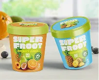
Shoppers decide in under three seconds whether to reach for a product or keep moving, and online they scroll past it even faster. That window is won or lost on four visual levers: color, typography, imagery, and layout. Color does the heaviest lifting because the eye registers it before it reads a single word. A confident, ownable palette cuts through visual noise and signals category and quality at a glance—think of how a single brand color can become shorthand for an entire product. Used deliberately, color also creates contrast against neighboring packages, which is exactly what pulls a passing glance into a stop.
Typography carries the message once color earns the look. Type has to be legible at thumbnail size and at arm's length on a crowded shelf, so hierarchy matters more than decoration: the product name, the variant, and the key benefit each need their own clear weight and scale. Pair that with imagery that communicates instantly—an appetite cue on food, a clean product render on tech, a texture that telegraphs the experience inside. The strongest imagery answers "what is this and why should I care" without the shopper reading a word, because most of them won't.
Layout is the discipline that ties the other three together. It governs where the eye lands first and how it travels, keeping the front panel uncluttered enough to be read in a fraction of a second. White space is not wasted space; it gives the hero element room to dominate and prevents the design from collapsing into a wall of competing claims. When color, type, imagery, and layout work as one system, the package stops the eye, holds it, and earns the reach—the whole job of shelf presence, done in seconds.
Brand Communication: Making the Product Instantly Recognizable
Packaging is the most honest sales conversation your brand ever has. Before a buyer reads a single ingredient or feature, the logo, color, and typography have already made a promise. That promise has to land in under a second, because on a crowded shelf or a thumbnail-sized product image, recognition happens faster than reading. The job of brand communication on a package is to compress everything you stand for into a visual shorthand the buyer recognizes without effort.
This works through three reinforcing layers. The logo and a consistent visual system give you instant identification — the same mark, palette, and type treatment repeated until the brain registers it as familiar. Voice carries the personality: the difference between a copy line that sounds clinical and one that sounds like a confident friend is the difference between a product people tolerate and one they trust. Positioning ties it together by signaling who the product is for and why it is worth choosing over the identical-looking competitor beside it. When these align, a shopper doesn't analyze the package — they feel it, and that emotional impression is what converts a glance into a pickup.
The discipline is consistency. A logo that shifts proportions between SKUs, a voice that turns corporate on the back panel, or positioning that contradicts the price tier all erode the trust the design is built to earn. Strong brand communication treats every surface of the package as the same speaker saying the same thing in the same tone. Done well, the product becomes recognizable enough that buyers find it before they consciously look for it — which is the entire point of putting a brand on a box.
The package fails the moment it stops doing its job. Functionality is where packaging design earns its keep — not at the shelf, but across the punishing journey from production line to a customer's hands. Structure that looks elegant in a render means nothing if the box crushes in transit, the closure leaks, or the material can't survive a humid warehouse. This is the discipline that protects the product and the brand around it.
Material Choice Sets the Ceiling
Every functional decision starts with the substrate. Corrugated board, rigid paperboard, glass, PET, aluminum, and molded fiber each carry different strengths, weights, barrier properties, and cost profiles. A premium cosmetic deserves rigid stock that resists denting; a shipped beverage needs a material rated for compression loads and moisture. Match the material to the real conditions the product will face — drop heights, stacking pressure, temperature swings, shelf life — not to an idealized studio scenario. The wrong substrate undermines everything printed on top of it.
Durability and Usability Are the Test
Durability is proven, not assumed. Pressure-test for stacking strength, validate seals against leaks, and confirm the structure holds through the full distribution chain so the product arrives intact. But survival is only half the job. Usability decides whether the package works in someone's hands: closures that open without a fight, resealable formats that actually reseal, dispensing that controls flow, and dimensions that fit a standard pallet or retail shelf. The strongest functional designs make protection and ease feel effortless — the customer never thinks about the package, because it never gives them a reason to.
Information Clarity: Answering the Buyer's Questions Fast
At the shelf, a buyer decides in seconds, and packaging that makes them work for answers loses the sale. Effective design treats the surface as a hierarchy of questions and answers it in the order people ask: What is this? What does it do for me? Can I trust it? How do I use it? The product name and category descriptor come first and large, so there is no guessing whether the jar holds moisturizer or cleanser. Directly beneath, the core benefit earns its place in plain language, not slogans. One clear promise beats three competing ones, because every extra claim the eye has to weigh adds a fraction of hesitation, and hesitation is what kills conversion at the point of decision.
Claims, instructions, and proof sit in the next tier. Specifics outperform adjectives: "30 SPF, water-resistant 80 minutes" tells a buyer more than "advanced protection." Usage instructions, dosage, allergens, and directions belong where a hand naturally turns the package, not buried in agate type on a back flap nobody finds. The goal is to let someone resolve their last objection without putting the product down.
Legal and regulatory information is part of clarity, not separate from it. Net weight, ingredient lists, nutrition or drug-facts panels, country of origin, and required warnings must be present, accurate, and legible to the standards of the market you sell in. Treated as an afterthought, compliance copy crowds the design and invites recalls. Designed in deliberately, it reinforces trust and frees the front of pack to do its persuasive job. Clear information is not decoration around the brand; it is the brand answering, fast, the questions that stand between interest and purchase.
How the Elements Work Together
Packaging design only performs when its four elements—visual identity, structure, materials, and regulatory compliance—pull in the same direction. Each one shapes how the others are perceived. A striking color system means little if the structure crushes in transit, and an elegant unboxing experience falls flat if the ingredient panel is buried or non-compliant. The shopper doesn't evaluate these parts separately; they absorb the package as a single signal of quality in roughly the time it takes to walk past a shelf. When the elements reinforce each other, that signal reads as trustworthy and premium. When they contradict each other, the eye catches the seam, and hesitation costs the sale.
The most common failure is imbalance—over-investing in one element at the expense of the rest. Brands that chase looks alone produce packaging that photographs beautifully but tears, leaks, or fails to protect the product, eroding the very premium impression the design was meant to create. The opposite mistake is just as costly: treating packaging as a compliance exercise, cramming legal copy and barcodes onto a generic box until nothing distinguishes it from the private-label option beside it. Neither extreme converts. Function without appeal is invisible; appeal without function breaks trust on first contact.
Strong packaging treats the four elements as constraints solved simultaneously, not a sequence of handoffs. The structure is designed around how the brand identity will wrap it; materials are chosen for both shelf appeal and durability; compliance is planned into the layout from the start rather than bolted on at the end. That integration is what separates packaging that merely contains a product from packaging that actively sells it—and it's where a quarter-century of branding discipline earns its keep.
Partner with The NetMen Corp's packaging design team to turn all four elements into shelf-ready packaging that protects your product and grows your brand.
If you want this kind of design system built with senior creative direction, clear deliverables, and production-ready files, explore The NetMen Corp services or get in touch to talk about your next project.