On Amazon, you have roughly 0.5 seconds to stop a scroll. That's it. Your main image either earns the click or loses the sale before a single word of your copy gets read.
Most sellers underestimate how much design drives conversion. They price competitively, write solid bullet points, and wonder why they're stuck at 2% conversion. Usually, it's the visuals.
Here's what you actually need to know about making packaging and listing design work on Amazon.
The Main Image: Your Highest-Leverage Asset
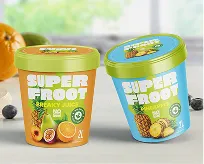
Amazon's main image rules are strict: white background, product filling at least 85% of the frame, no props, no text overlays. Work within those rules — they exist for a reason — but maximize the opportunity inside them.
What separates main images that convert:
- The product fills the frame. Small products lost in white space look cheap and unimportant. Get as close as Amazon allows.
- The angle is deliberate. The 3/4 angle almost always outperforms flat-on shots. It implies dimensionality and quality.
- The packaging itself does work. If your physical packaging has strong typography, a clean logo, and intentional color — the main image benefits. If your packaging looks generic, no photography tricks will fix it.
- High resolution matters. Amazon requires a minimum of 1000px on the longest side for zoom functionality. Soft, compressed images signal low quality before buyers consciously register why.
Images 2–7: Tell the Full Story
Once you've earned the click, your secondary images need to close the sale. Most top-performing listings use a mix of three types:
Lifestyle Images
These show the product in use, in context, by a real person (or a realistic representation of one). Lifestyle images answer the question: "Is this for someone like me?"
Use lifestyle images when your product's value is emotional or experiential — beauty, home goods, apparel, food. They trigger aspiration and trust simultaneously.
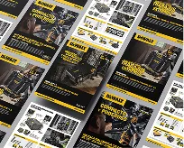
Infographic / Feature Call-Out Images
These show the product with text overlays highlighting key features, dimensions, certifications, or differentiators. They answer the question: "Why this one, not the cheaper one?"
Use infographics for products where specs matter — supplements, electronics, tools, anything with competitive technical advantages. Buyers in these categories read; give them reasons.
Best practice: use both. 3–4 infographics, 2–3 lifestyle images, plus your main. Give the algorithm image density and give the buyer a reason to scroll.
A+ Content: The Conversion Rate Multiplier
Amazon reports that A+ Content increases conversion rates by an average of 3–10%. For brand-registered sellers, this is non-negotiable territory.
What good A+ Content includes:
- Brand story module: Who you are, why this product exists, what you stand for. Buyers want to buy from humans, not warehouses.
- Comparison chart: If you have multiple SKUs, use the comparison module. It increases basket size and reduces returns by helping buyers self-select the right product.
- Feature deep-dives: Go deeper than the bullet points. Use images + text to explain what makes your product work, not just what it includes.
- Lifestyle photography at scale: A+ gives you more room for larger lifestyle images than the standard gallery. Use them.
A+ Content is not a place to dump text. It's a place to convert skeptics. Treat it like a landing page, not a product manual.
Packaging That Photographs Well (and Ships Well)
If you sell on Amazon and also sell at retail or direct-to-consumer, your packaging needs to work in both environments. Even if you're Amazon-only, packaging quality affects listing performance in three ways:
- Main image quality: Great packaging photographs better. Flat, cheap packaging produces flat, cheap-looking images.
- Perceived value: Packaging signals price point before buyers read your price. Premium packaging supports premium pricing and defends against cheaper competitors.
- Unboxing reviews: Packaging that delivers a good unboxing experience generates better reviews and social sharing — both of which feed back into ranking.
Common Mistakes That Kill Amazon Listing Performance
- Main image on a non-white background. Amazon will suppress your listing.
- Lifestyle images without people. Products in empty spaces don't sell emotion. Put a human in it.
- Text too small to read on mobile. Over 60% of Amazon browsing is on mobile. If you have to zoom to read your infographic, redo it.
- Inconsistent visual style across images. Each image having a different look, filter, or color treatment signals lack of professionalism and erodes trust.
- No clear hierarchy of information. Lead with the #1 reason to buy. Don't bury it in slide 6.
- Using generic stock photos for lifestyle imagery. Buyers can spot a stock photo. Invest in real shoots or high-quality imagery that matches your audience.
How to Audit Your Current Listing
Pull up your listing on mobile, on a small screen. Ask yourself:
- Would I click on this main image if I didn't know what the product was?
- After three images, do I understand what makes this product better?
- Does it feel like it's made for someone like me?
- Does the price feel fair for what's being shown?
If any answer is no — that's your conversion leak.
Ready to fix it? The NetMen Corp specializes in Amazon listing design and packaging that converts. Explore our product packaging design services and Amazon listing design services to see how we've helped brands stop losing the click.