PHONE: 1-888-519-3443
PHONE: 1-888-519-3443
Your logo is the face of your brand – it needs to instantly communicate who you are and what you stand for. But designing an effective logo is harder than it looks. Many logos fail to achieve their purpose because of some key mistakes.
We are a graphic design agency. We often assist clients with logo design and their corporate ID package. We have experienced these problems ourselves.
Don’t let your logo rush undermine the impact of this vital brand asset. Avoid these common logo creation mistakes.
Some logos try to literally depict what a company does through predictable imagery. For example, a pet store logo that’s simply a graphic of a dog or cat. The problem? This is visual cliché that customers have seen a thousand times.
Your mascot logo doesn’t need to visually explain your business. It just needs to represent your brand’s personality and values. A smart logo uses symbolic, abstract images that suggest – rather than overtly state – what you do.
You might have a competitor with a great logo that you want to emulate. Resist the urge to copy! Changing the idea may still make people see the similarities, which makes your brand look less credible and original.
Our stationery design team once worked with a client who requested a logo styled after its top competitor. We advised strongly against this, explaining the importance of having a unique brand identity. We won’t simply copy another company’s design work. Neither should you.
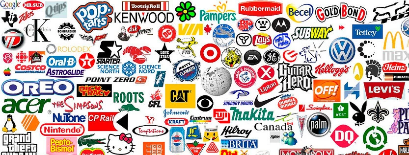
Certain logo concepts and symbols are so overused they’ve become meaningless. Generic shapes like squares, circles, and triangles. Stock images of lightbulbs, globes, and handshake graphics.
These visuals lack originality and won’t make people remember your brand. When going through concept designs, pick logo marks that are imaginative and not traditional.
Logos appear on all kinds of applications – everything from billboards to social media profile pictures. Will your logo’s design hold up when scaled to different sizes?
Some graphics and text details look great at full size but become illegible when shrinked down. Keep scalability in mind, especially if you’ll need icon versions of your logo for mobile screens. Test how it looks when enlarged and condensed.
Failing to do your homework is a common misstep. Don’t move ahead without first researching your industry, competitors, and target audience. This will uncover patterns to avoid (like overused concepts) and inspiration to leverage.
It also prevents unintended blunders – like failing to realize certain images are associated with existing brands. Proper research gives you insights that inform a unique logo direction. Don’t neglect this step.
Logos are most effective when kept simple and stripped down to basic, essential elements. New designers often clutter logos with too many visual components and decoration. But all those extra “bells and whistles” compete for attention rather than focus it.
Prioritize 2-3 core graphic elements at most. For example, combine a simple icon with your business’s name in a creative font. Keep it clean.
Speaking of fonts – beware of stylized scripts and display typefaces that hinder legibility. Remember, your logo includes your brand name. If people can’t easily read the full business name, the logo has failed.
Carefully test font options to ensure letters are recognizable at both large and reduced sizes. Or use a mix of stylized and simpler fonts – one for the icon and another for the company name.
Your logo will need to work across many contexts – from stationery to signage to social media. Is your design versatile enough?
Logos with intricate details or complex gradients can be inflexible. Simpler flat logos have an advantage, as they’re easier to resize and recolor as needed for different contexts. Test how your logo concept adapts to various media formats.
For example, something all brands have are business cards and corporate id packages. Make sure your logo will be useful to design stationery.
Trendy visual styles come and go. You don’t want your logo design to end up looking dated after just a few years. Evaluate design concepts through the lens of longevity.
Opt for a classic, timeless logo style that won’t become quickly outdated. Focus on clean lines, balanced use of space, and universal symbols. These withstand fleeting fads.
If your company operates in a crowded industry, you must take extra care to differentiate your brand identity. You want customers to instantly recognize your logo and not mix it up with competitors’ logos.
Do extensive competitor research during the design process. Identify what makes their logos effective, and do something noticeably distinct. Test logo concepts with focus groups to ensure your design stands apart.
Logos should retain brand recognition whether displayed as full color, black and white, or grayscale. But not all concepts meet this need.
Some logos depend heavily on specific colors. Remove them, and the impact is lost. Evaluate whether your chosen logo mark is just as effective in any color scheme. Don’t let adaptability fall by the wayside.
Don’t finalize a logo concept without thoroughly prototyping it first. To simplify the language of the sentence, we can split it into several shorter coherent sentences:
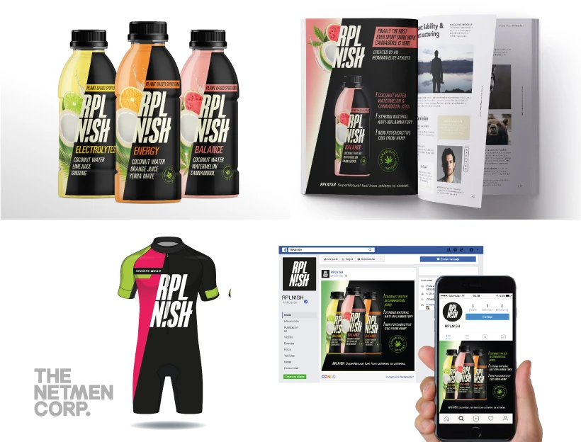
This process includes creating sample designs. We then test these designs on various items used by your company. Examples of these items include business cards, websites, and packaging.
Look at your logo on every format. Do some products need squared versions of your logo? Make adjustments until it works seamlessly. This avoids problems down the road after launch.
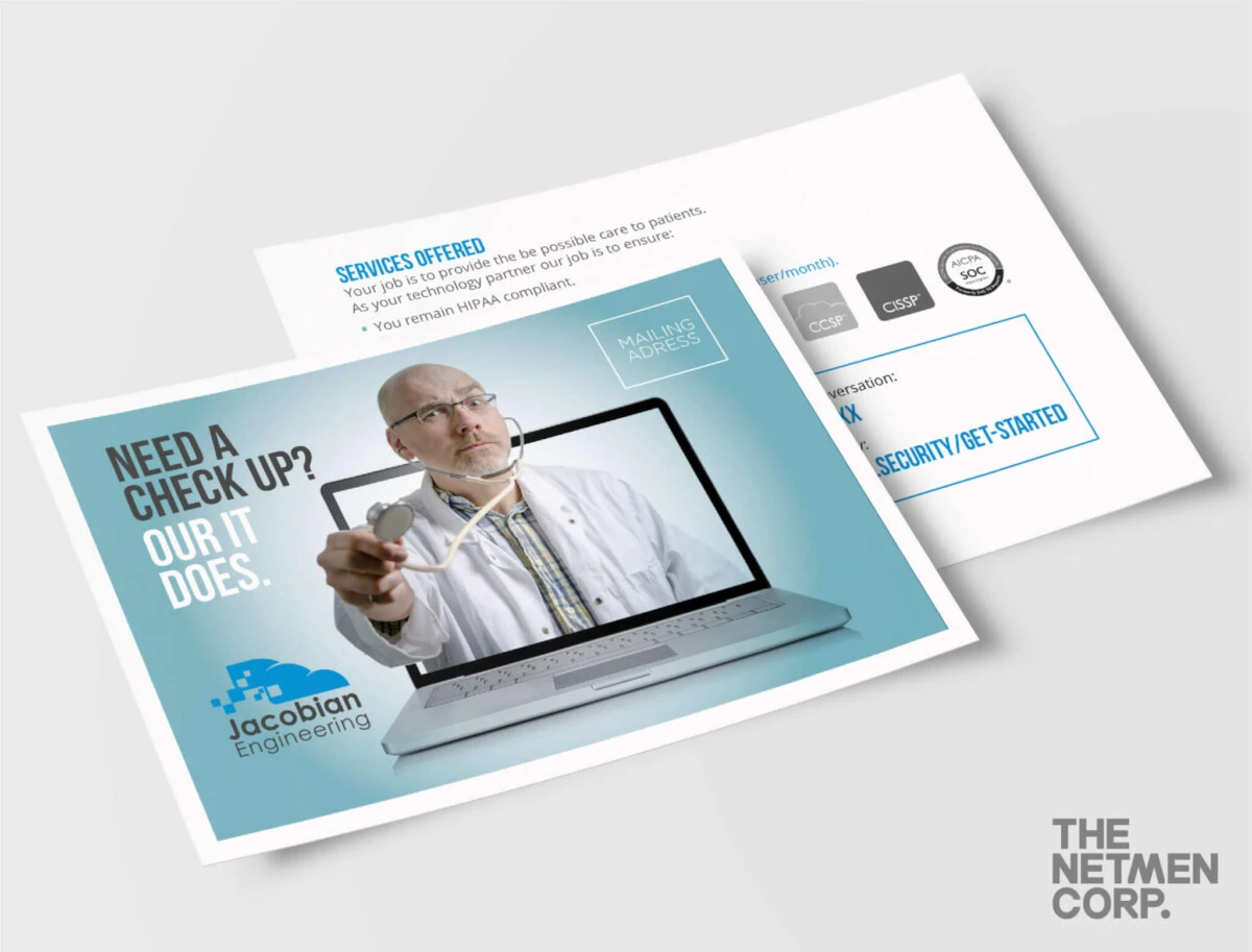
Tryout your logo in many different settings – a postcard design, a packaging design, and in more design templates. If it looks well, it means you have find the right logo.
Great logos seem inevitable – destined to represent that brand and no other. But they don’t happen by accident. By avoiding these key mistakes during the design process, you set your logo up for maximum impact.
If you are looking to order a logo design, or need help with any brand package, you have found the right graphic design team. With over 20 years of experience, The NetMen Corp is the perfect partner for all your brand designs. For logo design services, packaging design services and more, we are ready to help.
One of the most frequent errors in logo design is failing to align the visual elements with the brand’s core identity. A logo should not only look good but also communicate the brand’s values, personality, and industry. When designers prioritize aesthetics over meaning, the result is often a logo that feels generic or disconnected from the business it represents. Another common pitfall is overcomplicating the design. While creativity is essential, a logo that’s too busy or cluttered can be difficult to recognize, especially at smaller sizes or in black and white. Additionally, many designers neglect to consider scalability and versatility. A logo that looks great on a website might not translate well to a business card, packaging, or social media profile. Lastly, not testing the logo with the target audience can lead to a design that fails to resonate. Conducting user feedback sessions helps uncover blind spots and ensures the final logo meets both brand and audience expectations. By avoiding these mistakes, designers can create logos that are not only visually striking but also strategically aligned with the brand’s long-term goals.
One of the most frequent missteps in logo design is prioritizing aesthetics over functionality. While a visually striking logo can capture attention, it must also serve its purpose—communicating brand identity clearly and effectively. Many designers fall into the trap of creating overly complex or generic logos that fail to resonate with the target audience. For instance, using too many colors, fonts, or elements can dilute the message and make the logo less memorable. Another common error is neglecting scalability. A logo that looks great at 100 pixels may not translate well when scaled up for print or down for digital use. Additionally, overlooking the importance of negative space can lead to logos that appear cluttered or confusing. Brands often underestimate the need for a logo to be versatile across different mediums, from business cards to social media profiles. By addressing these pitfalls upfront, designers can ensure their work not only stands out but also delivers long-term value to the brand.
One of the most frequent missteps in logo creation is overcomplicating the design. Clients often prioritize uniqueness without considering scalability or readability. A logo that works in a vector format may become distorted when scaled down to a business card or app icon. Similarly, incorporating too many elements—such as text, icons, and gradients—can dilute the brand’s message and make the logo visually cluttered.
Another critical error is neglecting the target audience. A logo designed for a tech startup might rely on abstract shapes and minimalism, while a luxury brand may require elegance and sophistication. Failing to align the design with the brand’s personality can result in a logo that feels disconnected from its intended audience.
Color choices also play a pivotal role. While vibrant palettes might seem dynamic, they can be problematic in monochrome contexts, such as black-and-white print materials. Additionally, overly trendy colors or fonts risk appearing dated within a
One of the most frequent missteps in logo design is prioritizing aesthetics over functionality. While a visually striking logo is important, it must also serve its purpose—being easily recognizable, scalable, and adaptable across different mediums. Many designers focus too much on style and not enough on how the logo will perform in real-world applications, such as print, digital, or merchandise. This oversight can lead to a logo that looks great in isolation but fails to translate effectively in various contexts.
Another common error is overcomplicating the design. A logo should be simple enough to be understood at a glance. Too many elements, intricate typography, or excessive color schemes can confuse the audience and dilute the brand’s message. Additionally, neglecting to consider the target audience’s preferences or cultural nuances can result in a logo that doesn’t resonate with the intended market.
Finally, many brands fail to test their logo with real users before finalizing it. Without feedback, it’s easy to miss critical issues that could impact brand recognition and consumer perception. By addressing these common mistakes, designers can create more effective, impactful logos that truly represent their clients’ identities.
One of the most frequent errors in logo design is prioritizing aesthetics over functionality. Many designers focus solely on making a logo visually striking without considering how it will perform across different mediums and sizes. A logo that looks great at 100px may become illegible at 20px, leading to poor brand recognition. Another pitfall is overcomplicating the design. While creativity is essential, a logo should be simple enough to be instantly recognizable. Too many elements, fonts, or colors can confuse the audience and dilute the brand’s message. Additionally, neglecting scalability is a critical mistake. A logo must work in both digital and print formats, from a website header to a business card. Many clients also fail to test their logo with a target audience, assuming that what looks good to them will resonate with others. This oversight can result in a design that doesn’t connect with the intended market. By avoiding these common missteps, designers can create logos that are not only visually appealing but also strategically effective in building a strong, cohesive brand identity.
Many businesses fall into the trap of overcomplicating their logos, believing that more detail equals more impact. However, a cluttered design can confuse customers and dilute brand recognition. Another frequent error is neglecting scalability—logos that look great at a large size often fail to translate well when scaled down to a business card or social media profile. Consistency across all platforms is crucial for building brand trust. Additionally, some companies choose logos that are too generic or overused, making it difficult to stand out in a competitive market. A logo should reflect the brand’s personality and values, not just follow trends. Lastly, not testing the logo with real users can lead to overlooked issues, such as poor legibility or misinterpretation of the brand’s message. By avoiding these common pitfalls, businesses can create a logo that not only looks professional but also effectively communicates their identity to the world.
Many businesses fall into the trap of creating logos that are visually unappealing or fail to communicate their brand’s identity effectively. One of the most frequent errors is using overly complex graphics or too many elements in a single logo. While it may seem creative, this approach often leads to confusion and a lack of memorability. A strong logo should be simple, scalable, and versatile enough to work across different platforms and sizes.
Another common mistake is neglecting the target audience. A logo that appeals to a younger demographic may not resonate with a more mature or professional audience. Understanding who the brand is speaking to is essential in crafting a design that connects on a deeper level.
Additionally, many companies overlook the importance of color psychology and typography choices. Using the wrong colors or fonts can send mixed messages or fail to reflect the brand’s personality. A well-thought-out logo should not only look good but also align with the brand’s voice and values.
Many businesses fall into the trap of designing logos that are visually unappealing or functionally ineffective. One of the most frequent errors is overcomplicating the design. A logo should be simple enough to be recognizable at a glance, yet distinctive enough to stand out. Another common pitfall is using too many colors or fonts, which can dilute the brand’s message and make the logo appear cluttered. Additionally, neglecting scalability is a critical mistake—logos must look sharp and legible whether they're printed on a business card or displayed on a billboard. Some designers also fail to consider how the logo will be used in different contexts, leading to inconsistencies in brand identity. Lastly, not aligning the logo with the company’s values or industry can result in a design that feels out of touch or misrepresentative. By avoiding these mistakes, businesses can create logos that are not only aesthetically pleasing but also strategically sound, ensuring long-term brand recognition and trust.
Many businesses fall into the trap of prioritizing style over substance when designing a logo. One of the most frequent errors is creating a logo that’s overly complex or cluttered. While it might seem impressive at first glance, a complicated design can be difficult to recognize, especially at smaller sizes or in black and white. Another common pitfall is relying on generic templates or stock logo designs. These often lack originality and fail to reflect the unique identity of the brand. Additionally, neglecting to consider the logo’s scalability and versatility across different platforms can lead to inconsistencies in brand messaging. A logo that looks great on a website might not translate well to a business card or social media profile. It’s also crucial to avoid using overly trendy fonts or design elements that may quickly become outdated. A well-designed logo should be timeless and adaptable. Lastly, underestimating the importance of typography can result in a logo that’s visually unbalanced or hard to read. By avoiding these common mistakes, businesses can ensure their logo serves as a strong, recognizable symbol of their brand.
Many businesses fall into the trap of creating logos that look good in isolation but fail to represent their brand effectively. One major mistake is using overly complex typography that’s hard to read, especially at smaller sizes. A logo should be legible across all platforms, from business cards to digital banners. Another frequent error is relying on generic stock images or templates, which lack originality and fail to stand out in a competitive market. Additionally, neglecting scalability is a critical oversight—logos that don’t hold up when resized or viewed on different devices can damage brand credibility. Some designers also prioritize aesthetics over functionality, leading to logos that are visually pleasing but impractical for use. Lastly, not aligning the logo with the brand’s core values or personality can result in a disconnect between the visual identity and the business’s message. By avoiding these pitfalls, companies can create logos that are not only visually strong but also strategically aligned with their long-term brand goals.

Lorem ipsum dolor sit amet, consectetur adipiscing elit. Etiam aliquam iaculis purus eu facilisis. Quisque sit amet nunc non ipsum dapibus porttitor.
Lorem ipsum dolor sit amet, consectetur adipiscing elit. Etiam aliquam iaculis purus eu facilisis. Quisque sit amet nunc non ipsum dapibus porttitor.
Lorem ipsum dolor sit amet, consectetur adipiscing elit. Etiam aliquam iaculis purus eu facilisis. Quisque sit amet nunc non ipsum dapibus porttitor.