Logo design rules help keep a logo simple, recognizable, scalable, and useful across real business applications. A strong logo should work in color and black and white, remain readable at small sizes, feel distinctive in the market, and avoid unnecessary effects that make it harder to reproduce.
These rules are useful whether you are creating a new logo, reviewing logo concepts from a designer, or auditing an existing brand mark. The goal is not to make every logo look the same. The goal is to make sure the logo can survive websites, packaging, signs, social profiles, business cards, ads, embroidery, and print production.
Quick checklist: rules for a good logo
- Keep it simple: remove anything that does not support recognition.
- Make it readable: typography should be clear at small and large sizes.
- Design for scale: the logo should work on a favicon, package, sign, and presentation.
- Test black and white: a good logo should not depend only on color or effects.
- Avoid clipart and copied ideas: originality protects the brand from looking generic.
- Use color intentionally: limit the palette and make sure colors match the brand strategy.
- Think long term: avoid trendy effects that will feel dated quickly.
Logo design guidelines before you approve a logo
Before approving a logo, test it in the places where the brand will actually use it: website header, social avatar, packaging, storefront sign, email signature, black-and-white print, and small mobile screens. If the logo loses clarity in those contexts, simplify it before launch.
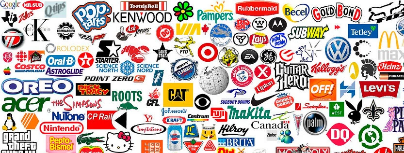
This list is an exploration of design principals used in some of the world’s most famous logos.
At the same time, the list was created as a way for designers to question themselves and the creative techniques they use when creating a logo design. Forcing the reader to reflect not only on the actual list, but also on their reaction to each listed insight, the last rule is the most important.
- Do not use more than three colors.
- Get rid of everything that is not absolutely necessary.
- Type must be easy enough for your grandma to read.
- The logo must be recognizable.
- Create a unique shape or layout for the logo.
- Completely ignore what your parents and/or spouse think about the design.
- Confirm that the logo looks appealing to more than just three (3) individuals.
- Do not combine elements from popular logos and claim it as original work.
- Do not use clipart under any circumstances.
- The logo should look good in black and white.
- Make sure that the logo is recognizable when inverted.
- Make sure that the logo is recognizable when resized.
- If the logo contains an icon or symbol, as well as text, place each so that they complement one another.
- Avoid recent logo design trends. Instead, make the logo look timeless.
- Do not use special effects (including, but not limited to: gradients, drop shadows, reflections, and light bursts).
- Fit the logo into a square layout if possible, avoid obscure layouts.
- Avoid intricate details.
- Consider the different places and ways that the logo will be presented.
- Invoke feelings of being bold and confident, never dull and weak.
- Realize that you will not create a perfect logo.
- Use sharp lines for sharp businesses, smooth lines for smooth businesses.
- The logo must have some connection to what it is representing.
- A photo does not make a logo.
- You must surprise customers with presentation.
- Do not use more than two fonts.
- Each element of the logo needs to be aligned. Left, center, right, top, or bottom.
- The logo should look solid, with no trailing elements.
- Know who is going to be looking at the logo before you think of ideas for it.
- Always choose function over innovation.
- If the brand name is memorable, the brand name should be the logo.
- The logo should be recognizable when mirrored.
- Even large companies need small logos.
- Everyone should like the logo design, not just the business that will use it.
- Create variations. The more variations, the more likely you are to get it right.
- The logo must look consistent across multiple platforms.
- The logo must be easy to describe.
- Do not use taglines in the logo.
- Sketch out ideas using paper and pencil before working on a computer.
- Keep the design simple.
- Do not use any “swoosh” or “globe”symbols.
- The logo should not be distracting.
- It should be honest in its representation.
- The logo should be balanced visually.
- Avoid bright, neon colors and dark, dull colors.
- The logo must not break any of the above rules.
Source: Tanner Christensen
Need a logo designed the right way?
The NetMen Corp creates custom logo designs, brand identity systems, stationery, packaging, and web assets for businesses that need a professional visual identity. Explore our logo design services or contact us to start your logo project.