PHONE: 1-888-519-3443
PHONE: 1-888-519-3443
Graphic design before computers was created by hand using tools like drafting tables, T-squares, ruling pens, X-Acto knives, wax paste-up, Letraset or dry-transfer type, phototypesetting, stat cameras, airbrushes, markers, and physical layout boards. Designers planned grids, cut and pasted artwork, prepared mechanicals, and worked closely with printers before digital design software existed.
Computers made graphic design faster and easier to revise, but they did not replace the core principles. Hierarchy, typography, composition, contrast, balance, and clear communication still matter whether a designer is working with paste-up tools or Adobe Illustrator.
Personal computers and desktop publishing made design faster, more flexible, and more accessible. Designers could edit type, color, layout, and images on screen instead of rebuilding physical boards. The biggest change was speed and control, not the disappearance of design fundamentals.

Digital desktop publishing rolled out in the mid-1980s when the launch of the original Macintosh computer set the design industry on a course toward the world we know today. The actual thinking behind graphic design hasn’t changed much. It just took much longer for designers to reach their final goal.
Here is a quick look at some of the common tools used in graphic design before computers:
Today, adding type to images is a breeze. Even the youngest of Snapchat users can add letters and words of all different shapes, sizes and colors to their snaps with a few finger taps. In pro-level designs, a small error or mistake in type can be cleared up in literally seconds.
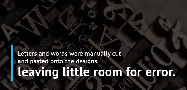
That was not the case with typesetting in the days before computers. In fact, inserting and manipulating type in designs was often one of the most tedious elements of graphic print design. That’s because letters and words were manually cut and pasted onto the designs, leaving little room for error.
When designers had a basic idea of the size and styles of type they wanted to use, they sent their orders to a typesetter who would print them overnight so the designer could implement (literally cut and paste) them the next day. If a designer wasn’t 100 percent sure about the size or font they wanted to use, they would ask for a few different sizes and fonts so they could play around with each.
Even still, options were limited. Today it’s effortless to manipulate the size, fonts and positioning of type. In the days before computers, making any wholesale changes to type could add an extra day or more to a project.
Adding type a breeze wasn’t always easy! The process of typesetting evolved. Here are some of those innovations.
Also called hot metal typesetting or hot lead typesetting, this was a method in which molten metal was injected into a mold to form the shape of a letter, number or symbol. When cooled, the metal was used to print ink onto paper.
In the very early days of hot type, molds had to be organized by hand to create words or complete lines of text. In the later days, machines such as the Linotype had keyboards that sped the process up significantly. Of course, it still took much longer than adding and playing with type does today.
Phototypesetting, or phototypography, is a process that eliminated the need for hot metal typesetting. Phototypesetting machines used the process of photography to create columns of type on photographic paper. Those letters, numbers and symbols could then be manually cut and pasted onto a design.
In the 1970s, magazine designers were living large as a new wave of phototypesetting machines made it possible for even modest-sized publications to produce professional-quality type. It helped speed things up enormously, though of course the process was obliterated in the mid-’80s when digital desktop publishing began to take over.
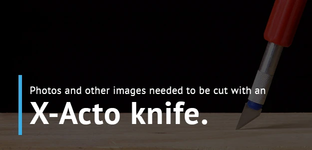
In the days of graphic design before Photoshop, working with images could be nearly as tedious as working with type. Photos and other images needed to be cut with an X-Acto knife, and designers had to be surgical with their skills to make sure it was cut correctly.
The backside of the image was then covered with hot wax or rubber cement — or in later days, adhesive spray — and placed in the correct position. If the positioning wasn’t spot on, designers broke out their trusty tweezers to move the photo to the correct location.
In the early part of a particular design or layout, black-and-white photocopies of the images or photos were used in place of originals to make sure everything was correct before moving ahead with the final project.
One thing we take for granted today with the availability of so many photo editing tools is the ability to quickly manipulate the image, whether it’s altering its actual size, creating a mirror image or adding some sort of effect. Graphic designers in the days before computers were inventive enough to come up with ways to handle similar tasks manually, but again it could be a very time-consuming process.
Once a print design was fully laid out, including all of the type, images and photos pasted in the correct position, there were a few final things designers had to do before printing the end product.
After all the necessary fixes were made, designers would give the layouts one more check to be sure. If there were no more issues, the pages were finally printed. If by chance a printed layout did happen to have a mistake or two, someone would no doubt get chewed out before the process resumed.
For those interested in an even deeper look at the evolution of print graphic design, there is an interesting documentary called “Graphic Means” worth checking out. At the moment the documentary is being screened at select theaters around the world, and the filmmaker hopes to bring it to Netflix in the near future.
You now have a basic overview of what it was like for print graphic designers in the pre-computer era, and we haven’t even touched on what it was like for those who handle graphic design for TV and movies. This was of course well before the days of CGI, which allows producers to quickly add graphic imagery to video.
One of the most famous old-school graphics used in film and TV is the MGM lion, the familiar image of a lion roaring in a circular cutout of the Metro Goldwyn Mayer logo. To record the roar in the early days of film with sound, a sound stage was built around the cage of Jackie the lion in 1928.
Talk about a violation of workplace safety.
Another cool TV/film logo from the pre-computer days belongs to the UK’s BBC 1. You have probably seen this iconic image, which includes the world globe constantly spinning while images of continents scroll horizontally behind it.
This was created using a small globe with the oceans painted in black metallic paint and the continents left with no paint at all. The globe was filmed rotating in front of a concave mirror, which gave the effect of continents whizzing by in the background. It was originally filmed in black and white, and the color was added later.
Even though desktop publishing and digital graphic design became available in the mid-’80s, it’s not as if everyone suddenly made the switch. In fact, it was common for some magazines to use the physical layout board method well into the early ’90s.
Once digital methods became more widespread, it saved money and loads of time. It also helped designers become more consistent across the board. Since digital technology makes it easier to revise and edit mistakes quickly, it gives designers the opportunity to pay more attention to detail.
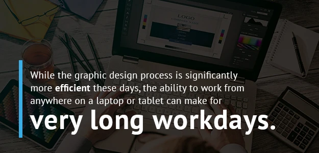
There are tradeoffs, of course. Some old-school designers may view a lot of today’s work as too antiseptic and devoid of a certain charm. Also, while the graphic design process is significantly more efficient these days, the ability to work from anywhere on a laptop or tablet can make for very long workdays.
Even though technology has advanced seemingly exponentially in the design world over the past 50 or 60 years, many of the principles at its core remain the same. Technology has helped speed up some of the processes that were at one time much more painstaking, but the qualities of great graphic design are constant:
For quality and 100 percent original design that can help your business meet its goals, look no further than The NetMen Corp. Our process begins with getting to know you and your company, so the design work reflects your values and corporate identity.
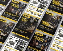
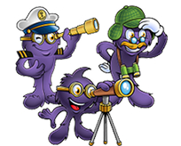
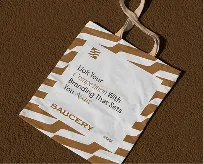
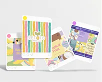
When you work with The NetMen Corp, you will always have a direct point of contact with the agency that will coordinate with our in-house design team. We offer many essential services including logo, print and web design, and we can go even deeper with services such as custom packaging or original mascots.

One thing that often holds businesses back from creating a graphical identity is cost. The perception is that high-quality original design is just too expensive. That’s not a problem with The NetMen Corp. We can begin your project for just $99, and since we have an 110 percent guaranteed satisfaction policy, contacting us is a low-risk move.
Graphical elements such as your logo and website are the first thing potential customers will see when considering doing business with you. Ensuring that your look is professional in quality and matches your company’s identity is invaluable.
The NetMen Corp creates logo design, brand identity, packaging, web, Amazon, and print design with a balance of creative craft and modern production. Explore our brand identity services or contact us to start your design project.

Lorem ipsum dolor sit amet, consectetur adipiscing elit. Etiam aliquam iaculis purus eu facilisis. Quisque sit amet nunc non ipsum dapibus porttitor.
Lorem ipsum dolor sit amet, consectetur adipiscing elit. Etiam aliquam iaculis purus eu facilisis. Quisque sit amet nunc non ipsum dapibus porttitor.
Lorem ipsum dolor sit amet, consectetur adipiscing elit. Etiam aliquam iaculis purus eu facilisis. Quisque sit amet nunc non ipsum dapibus porttitor.