PHONE: 1-888-519-3443
PHONE: 1-888-519-3443
Your logo is one of the first things the world sees about your company.
It conveys who you are and what you’re about. It can be bold, minimalist, bright or subdued. It can highlight an image or center text, or balance both with distinct color schemes, sizing, alignments and more — but designing one that’s eye-catching and effective is harder than ever.
In a world saturated with images and information, a recognizable logo is your chance to create a lasting first impression with prospective clients. Not only that, but logos often say more about your business than words ever can, in a fraction of the time.
What are the qualities of a good logo, one that piques attention while displaying creativity and brand culture? We’ve got a few of our tried-and-true logo design tips and logo design process details outlined below, answering the most common new logo design questions out there.
To understand why creative logo designs are so essential to the pulse of your business, you first have to understand the concept of branding.
Branding is the series of ways you distinguish your goods or services from the rest of your competition. More concretely, it is the collection of names, channels, symbols, icons, images, messaging and labels associated with your company, as well as the style and visual presentation of these elements. From product packaging to advertising to paid sponsorships, branding curates how you want to be seen by the world.
The most successful brands use their visual icons and messaging to create a customer experience. They make consumers “feel” something, forging an emotional identifier that’s simultaneous with further brand interactions.
In other words, branding gives meaning to your business. If you don’t have meaningful brand identifiers, then you don’t have recognizable logos.
A logo is the foundation for building a brand. A “good” logo is instantaneously recognizable, emotionally impactful, stimulating and unmistakable. They are essential for all these reasons — and more:
While you certainly don’t need universal brand awareness, you do need your logo to stand out. Not every brand will contain the dominating associations like the Nike swoosh or the Apple, well, apple. But at the very least, you should aim for the same premise of visual markers and set color schemes affiliated with your company. This makes it far more memorable to the average person.
The average person experiences roughly 1.59 hours of digital advertising a day, promoted mainly through television, radio, social media and general internet search queries. That number bumps up to over two hours when non-digital forms of advertising get factored in, such as direct mail, billboards, coupons, labels and packaging.
In total, our brains perceive between three to five thousand marketing messages every single day. Even if we tried, there’s simply no way to keep them all straight. Effective logo design placed in front of the right target audience cuts through the fog and stimulates direct interest in your goods and services — interest that’ll stick.
There’s a reason you feel a little betrayed when your favorite brands redo their logos. Often, you’ve forged a connection with that company, a connection a logo quintessentially represents. A recognizable logo helps connect customers with big and small corporations alike. It fosters a sense of security and loyalty, bringing them back to you like and old friend, time and time again.
Creating the perfect logo can feel like a balancing act. You need to convey professionalism and expertise, but also personality and style.
From business cards and company signs to t-shirts or work uniforms, you have the chance to use company logos to represent more than just a quirky slogan or aesthetic color scheme. Use your creative logo designs to translate your:
What does your business stand for? What motivated you to create your first product or launch your service in the first place? What sort of change do you wish to bring into people’s lives — and most importantly, what kinds of problems are you aiming to solve?
Without explicit company values in mind, your branding turns shapeless. You won’t be conveying your company’s personality coherently. Designs and on-brand messaging lose focus because you don’t have a central, guiding heartbeat behind your work. These kinds of values are not fluff. They’re important information to mold from the beginning and share openly, whenever possible.
Similar to spreading your values, recognizable logos also convey your work culture. These are the psychological and social factors that contribute to the actual environment within your business. This environment naturally pools into how you work and treat your customers and what those customers can expect from interactions with you.
Take, for example, the business cards of an established law firm compared to those from an app startup. The former will likely use fonts, colors and text that communicate their sense of expertise, competence and authority. The latter might opt for something striking and contemporary, focusing on an app-friendly logo design that resonates with their target market and translates easily to a smartphone screen.
It’s important to remember that designing a logo is about what you want to say to the world. But it must also be a reflection of who you really are — not wishful external projections.
The actual nature of your business — i.e., what you make or do — is another important note to include within your logo designs.
Logos tend to fall into three general categories: abstract, logotype or a combination of both. Abstract logos often contain the most conceptual representation of a product or service — though they still capture the essence of your company. Likewise, literal logos give you more concrete leeway to play around with product depictions.
Just be wary of a logo that’s too similar to your competitors. If you’re a new pizzeria looking to incorporate an image of a pie on your logo, for instance, take care not to create one like the other joints in town.
You should have a keen sense of what your company is about — so much so, in fact, that you should have a series of adjectives you can pull out of your back pocket to describe it.
These adjectives should hold true no matter what part of your organization a customer experiences. For example, if you have customer service lines, are they staffed and managed with same ideals as, say, your product-testing personnel? Are account managers privy to what creative is doing, and is creative taking into account brand feedback from account managers themselves? Is your company’s Twitter feed filled with humorous content while your Facebook feed veers serious?
All these questions better align internal operations to create what’s known as brand consistency. No matter what touchpoint a consumer is at with your brand, they’re getting clear, consistent messages. Your logo is part of brand consistency, portraying a uniform face alongside uniform communication styles.
Your logo must also curate an emotional experience for its viewer. Using tailored colors, lines, shapes, symbols and negative space, you can psychologically trigger meaning generation for a logo viewer. Numerous studies point to the parts of the brain that fire based on these various logo-design stimuli. In doing so, a mental and emotional experience occurs.
We’ve outlined logo design tips that serve to make your design more memorable, stimulating and conducive to brand loyalty. However, there are more functions to a logo beyond being just an eye-catching symbol, such as:
Designing a logo ultimately means designing a relationship between your business and its target demographic.
If this sounds like feel-good marketing speak, think again. Studies show companies that change their logos actually risk adverse reactions from their most loyal customer base. This is because people begin to see themselves in the brands they use, from their chosen tube of toothpaste to the morning newspaper they read. The logo represents that brand, and that brand is part of who they are.
Deep logo connections begin the minute a consumer perceives your branding materials, directly or subliminally. Since logos so often sit at the heart of visual advertisements — and visual advertisements are everywhere — the public begins to subliminally equate their entire self-image and quality of life with a company.
Your logo is going to land across many platforms and in many places, so you need to ensure it looks good no matter where it ends up.
Just think of its locations online alone. You’ll want a logo that transfers well to your company’s social media accounts to signal those accounts’ authenticity. You will also need a logo that complements the look and feel of your website, with harmonious color schemes, depths and relevant detailing.
This doesn’t even take into account physical logo placements — catalogs, pamphlets, brochures, apparel and merchandise. Then there’s packaging and product labels.
Just because your logo works in one capacity doesn’t mean it will work in all. It’s an often overlooked new logo design tip that needs testing and tweaking before full-scale implementation.
You don’t need a logo with absolute, guaranteed evergreen design appeal. In fact, that’s probably impossible. Logo design trends shift and evolve just like any other medium. They often mirror the most popular aesthetics trending in other industries, such as interior design, architecture and even fashion.
The most functional designs, though, should stand a perceptive test of time. They court certain design basics, such as enough white space, well-defined text and psychologically-appealing coloration — elements that never go out of style.
You might be rolling your eyes at this one, but the actual design concepts and creation of a logo cannot be undervalued — and there are many places it can go horribly, horribly wrong.
Take the importance of a logo’s font. Angular, sharp fonts and text have been shown to stimulate feelings of innovation and authority, while curved fonts generate warmth, trustworthiness and homeliness. Modern and minimalist typography instills a sense of chicness or “of-the-moment” trendiness, while cursive or script-like fonts make viewers feel a brand is more formal and potentially luxe.
You also need to consider whether these fonts pair well with logo images and if the images are in proper focus and have the right clarity and depth. Next, determine whether the images and fonts contain matching colors, line widths, proper spacing and balanced overall ratios.
Once you have these elements figured out, you need to ask if all this portrays an exact, meaning-filled message behind your business. If there is any point where these components don’t line up, it leads to serious branding missteps.
Every logo needs to be unique to be effective. Otherwise, it will drown in today’s advertising-saturated ocean. While this logic is the basis of creative logo designs, it is far easier said than done.
You can’t strive simply to be different, even if the goal is to rightly stand apart from competitors. What, then, makes a good logo “unique” — and how can you ensure your design is?
First and foremost, if your logo gives an authentic representation of your company’s values and work culture, you’re well on your way.
How can you measure the accuracy of value perception? There are a few key ways. Consider creating customer segment surveys that are short and tailored to brand-perception questions — nothing more than about eight questions that each only ask one thing. You can share these surveys through social media and newsletters, plus incentivize customers with product or service discounts, freebies or something else relevant to your target audience.
You can also measure the effectiveness of your brand perceptions through internal data gathering. Collecting information from sales and delivery departments might help you see how your value promises and advertising statements actually translate into consumers’ behaviors. You can then work insights into future logo designs accordingly.
Creative logo designs don’t have to be loud. In fact, they succeed more often when they go the other way. Busy, bright, high-contrast or overly “stuffed” logos deter the eye and can actually turn people off from your business or service.
Keep fonts and images clean and simple. Ensure the overall look is on-brand for your industry and is saying what you want to be conveyed.
We described earlier how logos need to transfer well across mediums. Effective logo design ensures they can be blown up or scaled down, printed in succession or filling space in isolation without looking sloppy or awkward.
Scalability is critical to conveying professionalism. Logos must also be designed to work well in various formats with different size restrictions. Image-centric logos, in particular, have to keep an eye on remaining balanced when printed in larger scales or included alongside other images or ads. The best logo designers know how to negotiate space to keep branding scalable.
Color schemes are at the heart effective logo designs. There’s an entire branch of psychology dedicated to understanding how colors affect humans.
Nearly 80 percent of consumers say color helps them perceive, identify and associate with brands, and it is a huge reason they feel drawn to them. Think the green shade of Starbucks and the bright red bullseye of Target. These colors are quintessentially tied to these companies.
Warm hues like reds and oranges have an energizing and awakening capacity. Brands using these colors are often cited as bold and provocative, but also playful and upbeat.
Cooler shades like blues and greens are calming, yet authoritative. They can be used both to convey power and security as well as a soothing approachability many consumers respond well to.
“Absent colors” include grays, whites and even black, in some cases. These are used as both primary and accent logo colors since they amplify so many visual details, as well as contribute their own psychological effects.
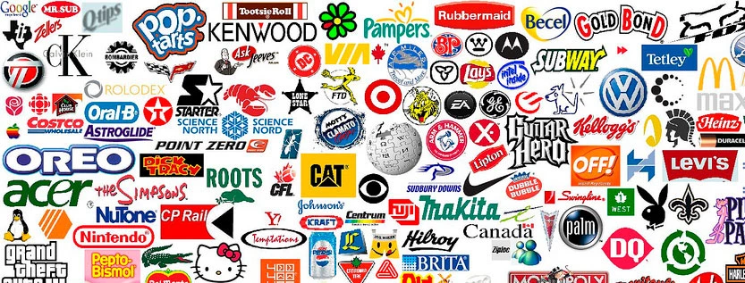
A final key color note? Of the world’s top 50 most recognizable brands, 43 of them use two colors maximum in their logos, with blue and red being the most common.
Sure, design will always be somewhat subjective. Peoples’ reactions to a brand logo will be influenced by personal style, tastes, age, background and other demographic qualities, many of which are impossible to universally nail.
That hardly means there’s no way to qualify a “good” logo, however. Classic and new logo designs alike carry similar traits, with the best, most recognizable ones displaying these characteristics:
Brands people report liking actually stimulate the areas of the brain that control self-perception and self-esteem. It’s a fascinating truth that can be measured and backed by brain-mapping fMRI findings, bringing data to something qualitative like logo design.
This is because logos are interpreted as symbols, and symbols, as we all know, are powerful because they represent abstract yet self-defining ideals. The more strongly held an ideal, the more a symbol or logo related to it will personally resonate.
Good logos will attract consumers. Great logos will make those consumers feel more like themselves.
Similar fMRI research indicates that it’s a consumer’s emotional response to a brand’s visuals — not its list of features and benefits — that sways purchasing decisions. People are three times as likely to use emotions to guide purchases after seeing a digital ad and twice as likely to do so after an emotion-producing print ad.
Whether you’re going for playful, educational, humorous or harrowing, your logo should be woven into the larger emotional story of your branding efforts. If it doesn’t do so, you’re missing a prime consumer influence.
Less truly is more when it comes to designing a logo. This means readable fonts, clear lines and clean shapes top the list of design mantras.
Too often, new or burgeoning logos try to cram everything into one insignia — their business name, business slogan, multiple colors and a picture or icons, sometimes multiples. This is all in a well-meaning attempt to designate the uniqueness of their brand, but it’s too much.
Instead, don’t go overboard. Keep logo colors to three at an absolute max. Be consistent in their usage and clean with fonts, shapes and final logo spacing.
There’s no brand quite like yours. How do you get the world to see it that way?
The NetMen Corp staffs in-house designers and account managers dedicated to all things visual. Whether you’re in need of logo work, website design, banners, brochures or something entirely its own, we’ve got the branding brains to craft your compelling corporate identity.
See our portfolio of logo work for yourself. You can also contact us directly to get started on a professional logo-design consultation.
Lorem ipsum dolor sit amet, consectetur adipiscing elit. Etiam aliquam iaculis purus eu facilisis. Quisque sit amet nunc non ipsum dapibus porttitor.
Lorem ipsum dolor sit amet, consectetur adipiscing elit. Etiam aliquam iaculis purus eu facilisis. Quisque sit amet nunc non ipsum dapibus porttitor.
Lorem ipsum dolor sit amet, consectetur adipiscing elit. Etiam aliquam iaculis purus eu facilisis. Quisque sit amet nunc non ipsum dapibus porttitor.