Stationery items like notepads, cards, and letterhead are daily essentials for many. These paper products help people be productive, organized, inspired and connected.
For both personal and professional use, well-designed stationery makes written communications higher quality and more impactful. It also makes recording ideas more enjoyable and brands appear more thoughtful. That is why creative choices matter, whether for sticky notes or brochures.

Know Clearly Who the Users Are
The first key for design success is understanding target users deeply. Will the stationery be for elderly individuals, busy moms, or urban millennials? Ask questions to build a detailed picture of user age, background, personal style, goals and budget.
These insights help decide things like colors, fonts, pictures, and paper types to attract the target customer. Fun illustrated stationery for a young girl looks different than minimalist stationery for a high-end fashion brand. Let user analysis lead all creative direction.
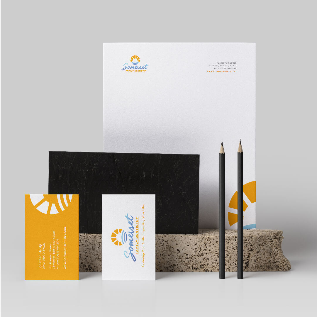
Link to Brand Identity
Also clarify upfront the core stationery purpose and use case. Will it be for holiday party invites or daily calendar planning? Occasional gifting or frequent internal memos? The specific context and communications goals impact aesthetic choices too.
Ensure all visual elements clearly support brand messaging around attributes like reliability, environmental-friendliness, luxury or intellectualism. Consistent identity alignment across business cards, letterhead, notebooks and everything in between is crucial so customers perceive cohesion. No graphic or text detail should seem random or work against what the company wants to convey.
Choose Colors for Emotional Effect
The selection of colors greatly influences the perception of stationery. Bright fun palettes feel playful and energetic. Deep hues like burgundy or hunter green appear grounded and prestigious. Neutral earth tones and metallics evoke luxury and sophistication.
Pastels signify springtime freshness and optimism. Determine what emotional response the stationery should drive in recipients and deliberately select colors to align both psychologically and symbolically. Remember that associations exist too, like red for urgency, yellow for happiness and green for eco-consciousness.
Feature Quality, Interesting Papers
For physical stationery especially, paper choice is hugely impactful. Materials are a core part of the tactile experience and first impression. Cheap, flimsy stocks undermine perceived quality fast. For more upscale client-facing stationery, opt for 100% cotton or linen papers with nice weight and texture.
Kraft papers, laid finishes and special organic pulp mixes also add flair and warmth. Or go Bold with dramatically dark endpapers and accents behind presentations.
Heavyweight, textured paper says substance and importance. Delicate paper implies refinement and intentionality. Find papers aligned to cost needs but use special stocks for key touch points.

Use Whitespace and Clean Layouts
No one enjoys using stationery that looks cluttered or crammed with content. Too much visual density is fatiguing. Whitespace and clean layouts make text or data stand out and capture user attention.
After placing key graphic elements, review overall balance. Give central details room to breathe without competing page components. Strategically leverage negative space to draw eyes towards must-see writing without overloading displays.
Rely On Legible, Familiar Fonts
When choosing typography, readability trumps flashy fonts. Fancy delicate script styles with lots of curls work sparingly as accents, like signifying a brand’s name. But for stationery intended to share meaty communications, use simple sans-serif or serif fonts readers recognize instantly. Test words at small sizes for legibility too.
Clean harmony between headline fonts and body copy leads to effortless information digesting every time. Avoid novelty display fonts that could impede reading comprehension or flow. Focus on easy reading to prevent user friction.
Incorporate Illustration and Artwork
Original graphic artwork and custom illustrations set stationery apart as special, upscale and engaging. Hand-drawn nature sketches, painterly designs, or geometric patterns feel personal compared to generic computer clipart. Frame text sections with illustrated borders or decorative dividers.
Mix artistic mediums too. Start with a sharp digitally produced typographic foundation then incorporate softer watercolored accents and shapes. Showcasing custom creativity demonstrates care into branding while raising perceived production value. It emerges people, not computers, made this.
With mindful planning and informed choices on color, font, paper, images and layout, custom-designed stationery simply performs better thanks to alignment with target users and brand identity. It makes communications more impactful and writing feel more fluid. For elevated outcomes, smart print design is vital.
If you are looking for an affordable graphic designer, or logo design in Miami, you found the right team. The NetMen Corp is a graphic design agency in Miami with over 20 years of experience.
We offer affordable design services, logo design services, custom stationery and more. If you need a brochure design, trifold design, corporate mascot, we can help you too.
