Subscription boxes have taken the world by storm. People can’t get enough of them. Receiving a surprise package in the mail is incredibly exciting. Opening that box feels like a birthday or holiday – you never know what delightful treats await inside.
But designing an outstanding subscription box experience is easier said than done. Many factors need to be considered. Also, many potential pitfalls should be avoided. Let’s explore the essential do’s and don’ts for nailing subscription box design.
Do: Captivate With the Outer Packaging
The outer box or packaging design is the very first impression subscribers get. It builds anticipation and intrigue from the moment that box arrives.
The outer packaging needs to grab attention and spark curiosity immediately. Use bold, vibrant colors that pop off the shelf. Incorporate unique shapes, interesting textures, or unexpected materials.
Make your brand’s logo or name like the prominent and recognizable. If you don’t have a logo design, there are many rush logo design services available. Give enticing hints about what might be inside without revealing too much. That outer wrap should make people eager to tear it open.
Don’t: Ship in Drab, Generic Boxes
On the flip side, using plain brown cardboard boxes is a surefire way to kill excitement. There’s nothing appealing or memorable about a basic box. It looks and feels entirely generic – the packaging design equivalent of watching paint dry.
If the outer box doesn’t spark any joy or intrigue, you’ve missed a huge opportunity to wow right out of the gate. Ditch the bland boxes and get creative with vibrant colors, patterns, and high-impact designs.

Do: Choreograph a Mind-Blowing Unboxing
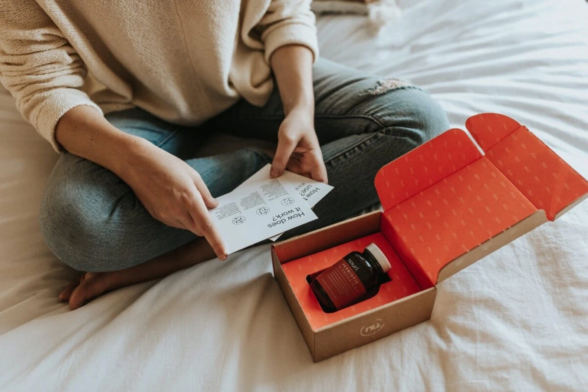
For subscription boxes, the unboxing experience itself is just as important as the contents inside. This is where the true magic happens through clever packaging design and presentation. Build layers of wraparound inserts, dividers, compartments, and nested boxes.
Unveil and present each item in an intentional, thought-out sequence that delights. Create a sense of revelry and discovery, with mounting excitement as you reveal each product. Incorporate fun personal touches like handwritten notes or creative product staging.
Don’t: Simply Throw Products in a Box
Putting no thought into the unpackaging flow is a critical mistake many subscription boxes make. Never just haphazardly toss items into a box – that couldn’t feel more careless and thoughtless. The thrill gets completely deflated if everything is jumbled together.
Take the time to carefully consider pacing, positioning, and how to showcase each product. The packaging design must create a climactic “wow” reveal when customers finally uncover the star items. A letdown unboxing can ruin the entire experience.
Do: Infuse Your Brand’s Story
The packaging design itself is an opportunity to breathe life into your brand identity and story. Strategically use colors, patterns, materials and design elements that reinforce brand recognition. Incorporate custom illustrations, icons, and messaging that communicate the brand narrative and values.
Subscribers feel invested in an engaging experience that elevates the subscription box from just products to a deeper brand connection. Touches like label design, custom postcard inserts, and branded boxes further strengthen that identity.

Don’t: Design in a Brand Vacuum
Generic, character-less packaging represents a missed opportunity to forge an emotional connection. It fails to tap into the power of branding and storytelling that resonates with customers.
Just putting a logo on packaging isn’t sufficient. The design should reflect your brand’s unique personality, voice, style, and values. Without this brand cohesion, the subscription feels impersonal and replaceable.
Do: Prioritize Sustainability
As consumers become increasingly eco-conscious, sustainable and ethical packaging design practices are crucial. Explore using recycled, recyclable, and biodegradable materials wherever possible. Design for easy recycling, with simple separation and minimal excessive components. And minimize any disposable or single-use packaging elements.
An overly wasteful box can taint the excitement and enjoyment with feelings of environmental guilt. Smart, innovative packaging design services can craft solutions that reduce environmental impact without compromising quality.
Don’t: Create Excessive Waste
Using too much plastic packaging like clamshells, foam inserts, and plastic bags takes away from the enjoyment of opening a box.
No one wants to confront an overwhelming amount of trash from their eagerly-awaited subscription delivery.
Choosing sustainability doesn’t mean giving up quality. Some brands design special, eco-friendly packaging. This creates a memorable unboxing experience.
They do this without sacrificing luxury. With some ingenuity, you can enjoy the best of both worlds.
For example, maybe instead of adding many flyers, having a well made postcard design with a nice message could suffice.
Do: Allow for Personalization
While consistency reinforces brand identity, the most delightful subscription boxes allow some level of personal customization or tailoring by recipients. Give customers a hand in making the experience uniquely their own. This could involve letting them choose colors, add personal labels or messages, customize accessories, select product options. Even if full personalization isn’t feasible, injecting elements of personalization and uniqueness month-to-month prevents feeling stale.
Don’t: Deliver an Identical Experience
If every box is the same, even if they look nice, people will get bored of them eventually. Variety is important. People crave spontaneity, newness and surprises – relying too heavily on repetition and sameness grows stale fast.
Packaging design services should change how packages look, what’s inside, or how they are opened for each shipment. This helps keep every delivery feeling fresh and special.
The subscription box industry is booming for good reason – these surprise packages spark delight like few other experiences.
Good packaging design that looks nice and works well makes a regular box special when you open it. Following these do’s and don’ts will ensure your subscription boxes consistently hit all the right notes. It’s all about thoughtfulness in design to craft anticipation, excitement, brand connection and memorable unveilings with each delivery.
If you are looking for a Miami graphic design company, at The NetMen Corp we are ready to help. Our affordable design services can help you create all your design needs at an affordable price.


