PHONE: 1-888-519-3443
PHONE: 1-888-519-3443
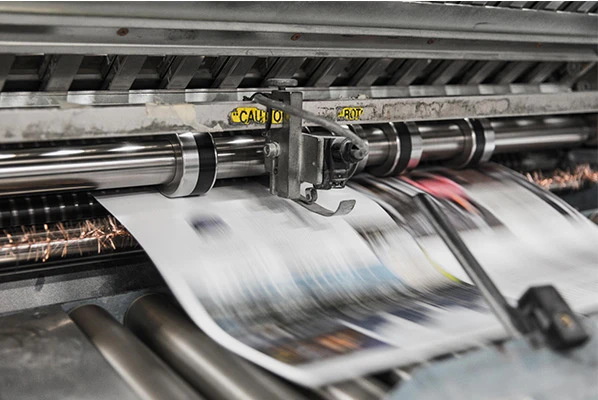
Designing a great deliverable is a creative process that many appreciate. However, an aspect often overlooked is how the concept goes from screen to the page. The task of converting a 2D digital image into a three-dimensional physical copy is filled with challenges and hurdles. By understanding a few print design few tips and tricks, you can learn how to design for print, enjoy the task and make it go as smoothly as possible.
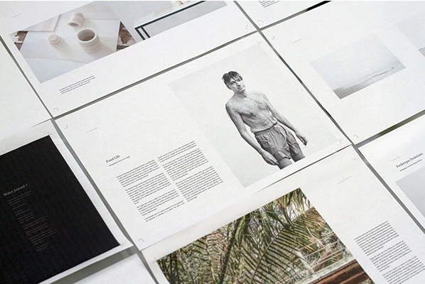
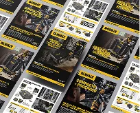
Print design goes further than just the act of printing. Some things to know about print design include deciding which digital form is best for the design, which material it should print on and which purposes different options are best suited for. Amongst these aspects, many others differentiate the act of printing from print design.
The final product affects how you should go about designing and printing it.
While these are common categories that many print designs can fall under, the choice is really up to the designer’s creativity.
Deciding when a file for a particular project is “print-ready” can be confusing, and many less experienced designers choose the one they are most familiar with and consider it to be sufficient for their purposes. But, the type of file you select does matter to the overall quality of a printed image. So, what does print-ready mean?
Characterization of file types falls into two different formats — vector and raster. Raster images use pixels which are tiny colored areas on a display screen that arrange themselves to form an image. These types of images are what you commonly see online.
Vector images are free from pixel constraint that scale to any size without loss of quality. Usually, specific image software is necessary to create vector images.
Which file is best for printing? More specifically, the five most common file types in print design include:
There are many other general files types as well as those exclusive to specific programs and operating systems, but to have the most success, use the file types above.
Resolution is especially crucial for print design. The resolution of the image or graphics determines the quality of the final physical product.
Two terms factor into the resolution of your printed image — DPI and PPI. Although they are similar, each plays a different role. DPI, or dots per inch, is the density of ink within each inch of a printed surface. This term is most important during the actual printing process and means little for web design due to it coming into play once an image prints on to a surface. Equipment set to require greater DPI means a higher quality image.
PPI, or pixels per inch, is how many pixels are displayed each inch of screen space. The higher the number of pixels in an image, the better quality the image will be. Lack of pixels causes distortion, blurriness and overall loss of quality. PPI has an interesting relationship with how an image appears once it is in print. A higher number of pixels per inch condenses the size of a print but also increases the quality. So to see the best results, you must determine the correct PPI for the desired quality and quantity.
A good rule of thumb is to print at 300 PPI. This recommendation correlates with the maximum amount that the human eye can recognize, and as a result, will generally mean a quality physical image.
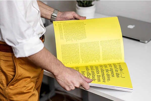
Images usually follow two different color schemes — RGB and CMYK. But the question remains, “Is RGB or CMYK better for print?”
RGB stands for red-green-blue. These are the primary colors of light and are used to represent all colors on a computer display.
As you probably know, the primary colors of pigment are red, yellow and blue. In printing, these hues are more precisely selected as magenta, yellow and cyan. With the addition of black, these are the four ink colors used in most printers. Together, they are abbreviated as CMYK for cyan-magenta-yellow-black.
Clearly, you’ll be using more than these four colors in your designs. Programs used for design assign codes to each custom color, which tells the printer what percentage of ink to use in each tiny section of a print.
When making your design digitally, keep in mind that what you see on your screen will not be quite as it appears after printing it. Be sure to go through a few test prints to make sure the color that shows up on paper accurately represents your vision.
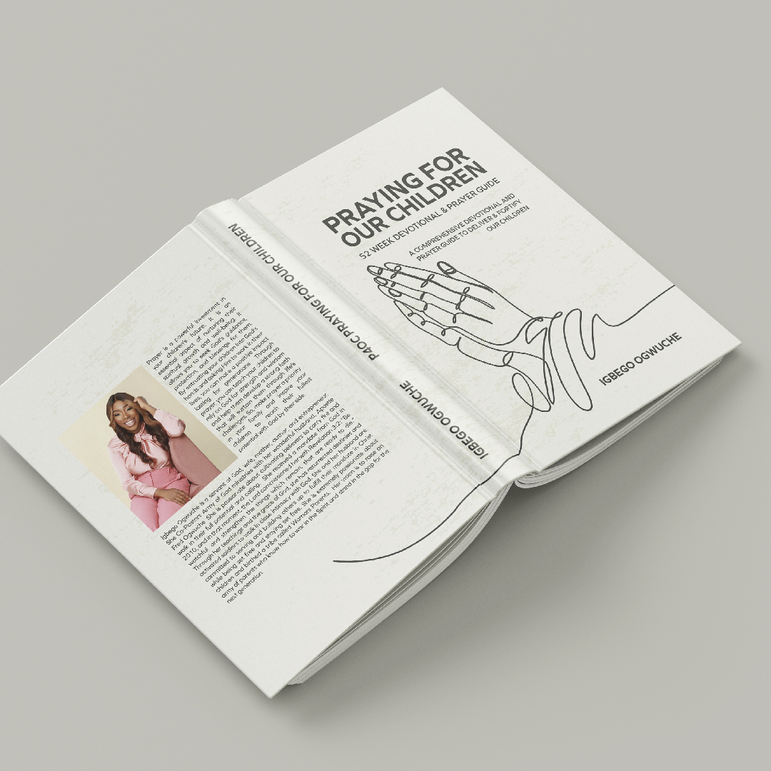
While any font can be used for print design as long as the designer has obtained the rights to include it, but there are some fonts explicitly optimized for the web. Print design has more freedom on what they think will be best for their specific project. The designer has complete control over what font and orientation best fits their needs.
One important aspect when including text in print is the kerning. Kerning is the adjustment of the space in between each character. A well-kerned piece of copy will have a visually equal space between each letter or symbol except for spaces. Ensuring this aspect is done well will keep a neat and orderly look to the information.
Another good rule of thumb when it comes to text is to limit the number of capital letters. While caps can be a powerful tool to emphasize certain vital parts of a print, adjusting the contrast can be a more professional way to get your point across without seeming too overpowering. Capitals also make it harder for the reader to distinguish words due to each letter being the same height. While they might seem like an easy way to stress pertinent information, there are better ways to achieve this.
Also, the size of your fonts varies massively depending on what form of print you are creating. A large billboard or poster may be able to get away with using smaller fonts, where a business card or smaller print might not be so feasible. When deciding on sizes, always get a second opinion. Just because your eyes can read the text file, doesn’t mean others can with as much ease.
The strategies designers use for digital web design and graphic design for print are not cut from the same cloth. While comparisons can be made, there are also vast differences as well. Most of these comparisons stem from the viewing method and appearance of the graphic. The differences between digital design and print design become clearer when we look more closely at the two categories they share.
The most significant and clearest difference between print and web design is the way that people view them. Browsing through a web page and seeing a graphic online is a drastically different experience compared to feeling a book in your hands, seeing an advertisement on the side of a bus or watching a billboard as you drive by.
Even if as the graphic is visually the same, the person viewing it is likely to interact with it differently according to how they view it. Seeing a physical copy is simple, and the extent of navigation might include unfolding a brochure or flipping a page. Web design may not be as user-friendly. Many different layouts and menu options must be evaluated and selected based on specific goals. Viewers’ screen sizes differ depending on what monitor or device they are using, and those size differences can affect how your design will come across.

While the differences in navigation and user ease when interacting or seeing a design are different, many of the ways to arrange content are often the same. Design elements such as shapes, lines, color and typography go into both digital and print design.
They both must also use the design space given for the graphic or information wisely. For print, they are many standard sizes such as letters, posters and business cards. But, printing surfaces can be cut to any shape and customized for specific needs. Web design can also tailor images to any dimension, but responsive designs that can easily be fit to appear normally on any device are more restrictive for online graphic designs.
A physical copy of the design excels by adding a tactile experience to the viewer experience. Your viewer can actually feel the texture of a print through effects such as embossing, letterpress and screenprinting. What competitive advantage web design has is the ability to incorporate interactive elements such as video and audio.
Consider a book. Many prefer having a physical copy because they like the feel of it in their hands. You can also easily highlight essential passages and truly see your progression as you turn the pages. E-books might not provide these benefits in the same way but have unique features such as useful hyperlinks or audio narration throughout the book.
When a physical design is final and ready for printing, any mistakes should be accounted for and corrected.
Redesigning and printing costs money and consumes time. Web design can be edited at any time, even if it has already become final. A good example is a breaking news story, which expands with more information, photos and illustrations as more intel gathers. Prints require vast more certainty than digital designs.
If you would like to leave your print design services in the hands of qualified professionals at a dedicated print design agency to achieve the best results with ease, contact the NetMen Corp today. Our areas of expertise include:

Hiring the right talent for all of the skills above is not easy, and learning print design is not for everyone. But, outsourcing these facets leads to a successful operation and great savings while arriving at superior print design. Our packages start at as little as $99 and can be customized to fit your exact needs. Check us out today.
Sources
https://thenetmencorp.com/
https://www.fastprint.co.uk/blog/how-to-design-for-print.html
https://www.printmag.com/imprint/print-design-what-you-need-to-know/
https://www.canva.com/learn/print-vs-web/
https://www.canva.com/learn/design-rules/

Lorem ipsum dolor sit amet, consectetur adipiscing elit. Etiam aliquam iaculis purus eu facilisis. Quisque sit amet nunc non ipsum dapibus porttitor.
Lorem ipsum dolor sit amet, consectetur adipiscing elit. Etiam aliquam iaculis purus eu facilisis. Quisque sit amet nunc non ipsum dapibus porttitor.

Lorem ipsum dolor sit amet, consectetur adipiscing elit. Etiam aliquam iaculis purus eu facilisis. Quisque sit amet nunc non ipsum dapibus porttitor.