PHONE: 1-888-519-3443
PHONE: 1-888-519-3443

A restaurant’s menu is one of the most important parts of its brand identity and marketing materials. It’s often the first thing a customer interacts with and what convinces them to order. The menu layout and design impacts the overall dining experience.
When designing a menu, restaurants need to find the right balance between visual appeal and usability. A creative food flyer design should communicate the style and cuisine of the eatery. It also needs to allow customers to easily navigate options and prices.
Here are some do’s and don’ts for creating a menu that works.

One of the best ways to get customers excited about menu items is showing off beautiful food photography. Professional photos allow you to showcase ingredients and preparation in an idealized, mouthwatering way. Only use photos of dishes that will consistently match the actual plate that comes out of the kitchen. Misleading customers with photos that look better than real life is a recipe for disappointment.
While extensive selections might seem impressive at first, too many menu items can overwhelm customers and make ordering difficult. Try to limit your offerings to a cohesive collection of your best dishes. Focus on quality over quantity and change up specialty or seasonal items regularly to keep things interesting.
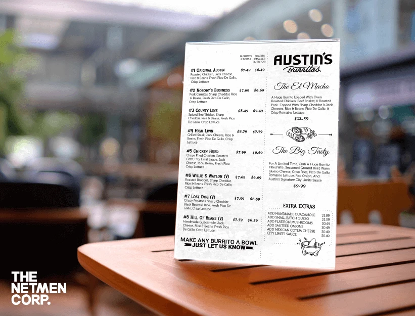
A modern flyer design sometimes is the best option for a simple yet legible menu for your business.
A menu shouldn’t be a disorganized mess of text that customers struggle to makes sense of. Use clear sections, divisive page formatting, and concise menu item descriptions to communicate everything clearly. Consider starting with appetizers, then soups and salads, entrees, and finally desserts. Consistent structure from section to section creates a flow.
Having the help of a print designer might be essential for this step, as they will provide valuable feedback.
Fancy cursive scripts and ornate font choices might reinforce a brand’s sophistication. But they shouldn’t come at the expense of readability.
Small, illegible text defeats the purpose of a menu. Go for simple, clean fonts and adequate spacing between lines and menu sections. It’s also smart to stick to a single column rather than splitting into multiple columns that require scanning back and forth.
Professional design services will know how to create an eye-catching menu, while also providing something that represents your visual identity.
Strategic menu groupings guide customers toward more profitable orders. Place higher margin items at prime locations on the first page. Group items by dietary preferences like vegetarian or gluten-free. Suggestive selling wording like “frequently purchased together” for menu item pairings nudges people towards combinations.
Customers visit restaurants to eat, not to read a book. Too much descriptive content starts to feel overwhelming. Keep menu item descriptions concise.
Focus on key details like the cooking method and highlight one or two standout ingredients. For example, “Pan-seared salmon with lemon caper sauce” is more appealing than a lengthy paragraph.
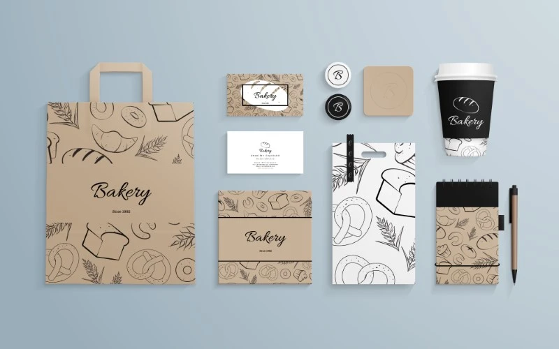
Also, always consider having professional stationery design in case your customers want to take your business cards home.
Drawing attention to daily specials encourages ordering these frequently higher priced or more profitable dishes. Specials also build anticipation around what your culinary team focuses on each day. Place daily specials prominently in a box on the menu cover or insert slipcovers to easily swap them out. Pair specials with drink recommendations to boost beverage sales.
Nothing is more frustrating than combing through a menu multiple times to find basic information that should be obvious. Make sure to clearly indicate prices for every item. Highlight specialty diets or dishes that contain common allergens like nuts or gluten. Providing these practical details upfront is respectful to customers.
Everything from the shape, color, texture, and weight of the menu impacts the customer experience. Square or horizontal orientations feel more casual while vertical menus come across as more formal. Muted earth tones fit with naturalistic brands, while jewel tones or stark blacks and whites reflect modern minimalism. Match the menu cover material to the restaurant decor too.
Customers appreciate consistency. Drastically redesigning the menu too frequently comes across as indecisive rather than innovative. Tweak things gradually over the course of several printings.
When making updates, balance novelty with tried-and-true comfort foods. Customers want to find their go-to orders along with some new options to explore.
Menu engineering involves carefully designing the layout and content of menus to influence customers towards more profitable purchases. This starts with menu formatting – draw attention to higher margin dishes by placing them at the top of the menu or in the upper right hand corner.
You can also play with price anchoring. List a high-priced item (that you don’t expect to sell much of) next to a more reasonably priced option to make the second dish seem like a relative bargain. Creative naming is another trick – an item labeled “house specialty” or “chef’s favorite” piques interest.
Before getting carried away with creative flair, ensure your menu covers all the essentials. Start with accurately labeled sections for different courses or types of dishes. List menu items in an organized, easy-to-scan format. Use bullets, headings, or table dividers to distinguish sections.
Make it clear which dishes contain specific allergens like gluten, nuts or dairy. If some items are only available during certain hours, indicate this prominently. Don’t forget to include basic information like restaurant name, address, phone number and website.
Everything from the colors to the language on your menu should match the broader branding and atmosphere of your restaurant. A family-friendly pizzeria would design a menu with bright colors and playful language. In contrast, a high-end steakhouse aims for sleek black and white with more formal descriptions.
Plenty of online graphic design resources make it tempting to go over-the-top with pictures, banners, borders and other complex elements. But remember that a menu needs to remain highly functional. Fancy graphics and elaborate photos should enhance, not overwhelm the actual content. White space and minimalism helps key info stand out.
The menu gets handled frequently and needs to be durable. Standard paper menus easily tear, stain, and wear out. Invest in higher quality paper, lamination or use alternate materials like wood or acrylic for a menu with longevity. For disposable paper menus, consider using more eco-friendly recycled paper stocks.
To cram in more items, some menus use minuscule font sizes that require squinting to decipher. Font shouldn’t be smaller than 10 or 11-point size. Scale font size up for sections meant to draw attention. Senior citizens make up a significant portion of the dining population – make allowances for aging eyesight.
With these additional tips in mind, you can optimize your restaurant’s menu design and functionality. A menu says as much about your brand as the food itself. Putting thought into layout, pricing strategies and design nuances makes an impression on customers as soon as they sit down. Take the time to craft a menu that not only informs but delights.
Creating a menu requires balancing visual creativity and functionality. Keep these do’s and don’ts in mind to design a menu that represents your restaurant’s style while also making the dining experience smooth for customers. Pay attention to layout, photography, organization, fonts, descriptions, and aesthetic details. With strategic menu design, your restaurant can mouthwateringly showcase offerings and brand ambiance.
At The NetMen Corp, we offer all kind of graphic design for flyers, menu designs, print design, and stationery design. We are an affordable graphic design company, with over 20 years of experience.
If you are looking for professional graphic designers in Miami, contact us today to get your project started!