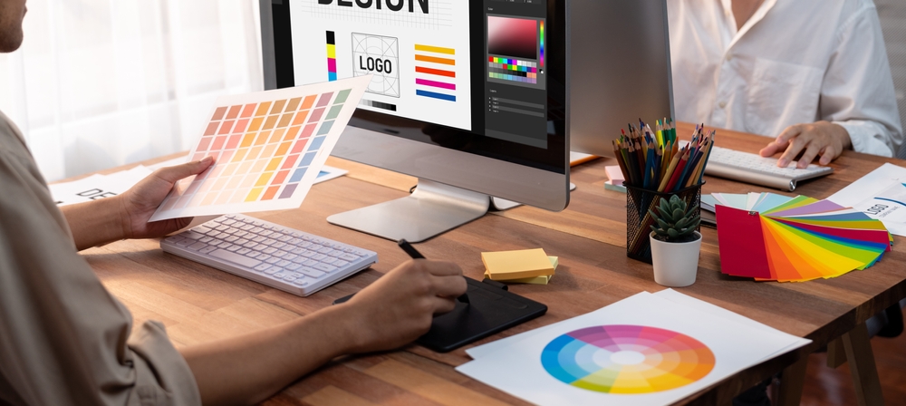
The colors you use in your business’s logo design, branding, marketing materials, products, and spaces can have a huge impact on how customers perceive your company and even influence their purchasing decisions.
Our graphic design Miami team of experts often helps clients leverage color psychology appropriately. We do this through services like logo design, real estate graphic design, packaging design, and more.
Knowing how colors affect emotions and following design tips can increase your sales and profits.
Discover color psychology principles and use them to influence customers effectively.
The Meanings Behind Colors
Colors have different meanings in graphic design in Miami and Western marketing. Here is a brief summary of their common associations.
Red – Energy, passion, urgency, excitement
Orange – Confidence, creativity, happiness
Yellow – Joy, optimism, clarity
Green – Growth, peace, health, wealth
Blue – Professionalism, trust, stability, security
Purple – Luxury, ambition, imagination
Black – Power, sophistication, exclusive
White – Purity, simplicity, cleanliness
Logo Design Services and Color Psychology
Choosing the right colors for your company logo can set the tone for your whole brand identity. When reviewing various logo portfolio examples, you’ll notice how color has a big influence on which designs grab your attention first. Brighter, warmer hues tend to draw the eye rapidly compared to cooler, darker shades.
McDonald’s, Subway, and Dairy Queen use red in logos to make people feel excited and hungry. Green is ubiquitous in finance and healthcare industries since it signifies stability and health respectively. Most of them also have a corporate mascot logo in bright colors, to express happiness.
Our professional logo design services team also often recommends blue for businesses that want to convey trust and dependability. Companies like law firms, medical providers, banks, and technology firms use various shades of blue in their logos.

Product Packaging Design
Color trends in packaging design services follow similar psychological principles. For example, black packaging tends to signal luxury status for high-end beauty products or spirits. Silvery accents also imply sleek sophistication in modern product design.
Meanwhile, eco-friendly brands lean on lots of green packaging to emphasize sustainability. Vibrant multi-colored designs capture attention for children’s goods or fun snack foods in grocery stores.
You can display some logo portfolio examples in product packaging to reinforce brand identity through color as well. Potent color pairings like complementary hues can make displays pop on shelves to improve sales.
Interior Design Impacts
Every design choice for physical retail spaces should strategically use color on walls, furniture, flooring, and textiles. Soft green, beige, and blue interior design elicits a relaxed, comforting environment often perfect for restaurants, salons, and spas. Work with a real estate graphic design agency to create personalized colors and branding for your store and customers.
Digital Design Influence
While in-person settings utilize tactile, sensory color cues, even screen-based graphic design impacts behavior. The sinus-igniting combo of bright yellow and red captures attention for call-to-action buttons online.
Scams and shady websites often have bright, clashing colors that make visitors feel uneasy and suspect something is wrong. So be sure your digital presence sticks to a harmonious, professional color palette.
Be Strategic and Subtle
When emphasizing important ideas, avoid using too many bold and bright colors in design and marketing. Consumers tend to distrust overly hype techniques like neon signage or clashing website palettes.
The most effective color psychology subtly guides the experience while aligning with branding. Make strategic choices based on industry standards, target audience interests, and desired perceptions. Partner with our expert graphic design Miami team to workshop the optimal color strategy through your logo portfolio and all branded touchpoints.
Combined with shapes, spatial elements, typography, and more, thoughtfully selected colors create holistic design experiences that influence customers on conscious and unconscious levels. Even small shifts in hue, saturation, and brightness can have big impacts on conversion rates. You should constantly test and refine to maximize positive responses.
Industry-Specific Color Psychology
There are several best practices, well-established associations, and evolving trends when strategically employing color across different industries. Let’s explore some potential opportunities tailored to specific sectors:
Healthcare brands like hospitals, insurance providers, pharmaceutical companies, and doctors’ offices often use blue, green, and white colors in their branding. Serene color choices reinforce sanitary impressions, professionalism and hope that facilitates healing.
Recently, many healthcare companies add a third accent color like purple or orange to uniquely stand out, particularly on websites or advertisements.
Financial Firms: The financial sector almost exclusively utilizes navy blue, green, black, silver and maroon. This is for omnipresent themes of trust, stability, sophistication and guaranteeing returns on investment. Most major investment banks, insurance agencies and accounting firms leverage these signature colors across offices, consultants’ outfits, reassuraceveraging, monthly statements and more. However, a few boutique financial startups attempt modern, minimalist styles deviating from stuffy wealthy stereotypes.
Top fashion and cosmetics brands are known for their vibrant and elegant colors that catch people’s attention. Chanel, Yves Saint Laurent, and Christian Dior use black and gold to show their luxury and high quality.
Meanwhile, trendy athleisure apparel companies embrace brighter pops of color tied to vitality and youth. Skincare and makeup labels also compete through coral pinks, minty teals or raspberry shades hinting at fragrant, refreshing products.
Practical Tips For Applying Color Psychology
Once determining target industry norms and intended brand personalities through color, there are several best practices our graphic design Miami team recommends for implementation:
- Test multiple color combinations with your demographic using tools like SurveyMonkey to empirically determine optimal palettes based on reactions.
- Carefully balance accent colors against more neutral backgrounds. Never underestimate the power of white space to prevent visual overload.
- Obsess over finding exact hex codes, Pantone values or other color specifications you love rather than settling. Slight hue tweaks make big differences.
- Make sure all visual branding elements support consistent color messaging across logos, mascots, websites, packaging, uniforms, signs, etc.
- Regularly update color schemes to stay current with trends and new products while maintaining brand identity with visual cues.
Let our graphic design specialists help audit your current use of color in marketing and design. We likely have some science-backed recommendations to boost aesthetics and persuasive appeal through color. Contact us now to enhance the utilization of color psychology in your business. This includes areas such as logos and packaging.
If you are looking for logo designers in Miami, or a team of graphic designers, you have found the right team. We offer affordable web design, business cards design, and more! If you are looking to design a logo or create designs, we are ready to help you.
