PHONE: 1-888-519-3443
PHONE: 1-888-519-3443
Graphic design offers many chances to make errors when creating logos, brochures, or websites. Even experienced graphic designers can fall into traps and end up with a less-than-effective visual communication piece.
You can easily avoid most graphic design mistakes with knowledge, planning, and an eye for detail. Learning what pitfalls to watch out for will level up your graphic design skills and ensure your creations make the right impression.
In this article, we’ll discuss ten common graphic design mistakes and provide tips to avoid them in your own projects.

Readers need to be able to quickly comprehend the message in your design. While creativity has its place in the design process, the end product still needs to effectively communicate. Complex or distracting design makes it hard for the audience to understand your message.
Use complex designs for experimental projects, but keep it simple for designs with a specific purpose and message.
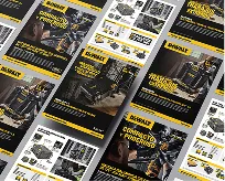
Font selection can make or break a design. Elegant script fonts might look beautiful for homepage headers but often become illegible when used for body text. Basic fonts like Arial or Times New Roman are readable but not visually interesting.
You should lways compare what you want to design with what is already successful. For example, if you analyze printed designs or professional logo designs, you will notice that they are always legible.
Get familiar with font pairings that check the boxes for both aesthetics and usability. Rely on easy-to-read sans serif fonts for large blocks of text and bring in more distinctive serif or display fonts for accents.
Just as using too many ingredients can spoil a dish, using too many fonts and colors can weaken the impact of your design. As a general rule, aim for no more than two or three fonts and colors in a single design. This helps create cohesion and draws the eye to the most important design elements. We can make exceptions for experimental pieces, but having too many competing fonts and colors typically muddles messaging.
Careful use of white or empty space helps guide viewers through your design. When a layout feels cramped, it loses details and messaging becomes less effective.
Leave breathing room between items to create contrast. Use whitespace to draw attention towards focal areas like headlines. Similarly, ensure there is adequate spacing between lines of text for improved readability.
Specially when you design stationery, you should always balance the white space with the text for better visibility.

Consistency creates familiarity for readers as they move through your design. Using the same fonts, colors, text sizes, line spacing, and image styles throughout makes your message feel cohesive. Inconsistency takes readers out of the flow as their eyes try to realign between contrasting elements. Before finalizing your design, carefully review and align repeating elements.
Professional graphic design agencies know that all brands should have consistency in their designs to be succesful.
You spellchecked the text and proofread thoroughly… or did you? It’s easy to overlook small errors in your own work. Ask a second set of eyes to review your creations, whether it’s a trusted colleague or friend.
Common mistakes that can happen are typos, uneven spacing, pixelated images, low-quality images, and misaligned design elements. Don’t undervalue the importance of a final polish at the end.
Certain accepted practices for sizing, spacing, and contrasting text exist for good reason—they maximize legibility. Ignoring standards for line spacing, text size, line lengths, and contrast ratios between text and background colors is risky. Following guidance published by reputable sources leads to greater readability.
Pixelated, distorted, or blurry images reflect poorly on designers. Begin projects with the best photos or graphics and make sure you have high-resolution files to work with. When displaying images at different sizes, manually adjust resolution rather than allowing programs to resize on their own.
Take the time to inspect images at 100% scale for artifacts or loss of sharpness. High-quality visuals make a huge difference.
Well-designed pieces should be usable and understandable to audiences with disabilities. Failing to accommodate issues like color blindness or poor vision negatively impacts overall effectiveness. Design responsibly by adhering to accessibility standards and guidelines.
Focus on color contrast, text/icon sizes, alt text for images, screen reader compatibility, and keyboard navigation flexibility.
Listen carefully if multiple parties mention similar issues related to legibility or messaging.
Be willing to make changes if certain aspects prove difficult for viewers to understand or use. Good design is inclusive. Keep the door open for constructive feedback.
Professional graphic design services providers will always ask for your feedback while working. Any design project needs feedback and unlimited designs to be successful.
Graphic design is part science and part art. Mastering visual communication requires avoiding common mistakes as well as honing your creative abilities. Pay mind to readability, accessibility, image quality, consistency, and getting second opinions.
Before you start, establish design objectives and periodically check that you remain aligned with your original goals. And never stop asking yourself, “Will the intended viewer understand what I’m trying to convey here?” Constantly balance aesthetics and functionality.
Now, after discussing common graphic design mistakes, let’s look at practical ways to prevent these errors in your work.
Using some of these strategies will help you find mistakes and make your work better.
Don’t jump right into designing until you’ve done your homework. Understand the audience, message, accessibility, and technical requirements for effective communication.
Reference similar existing designs and content structure to help conceptualize. You should list out all text and images you’ll need to obtain. Solid planning goes a long way.
If you are looking for logo design services, before starting your project, create a moodboard of what you are looking to achieve. This will help achieve a better design product.
Ensure text remains easily scannable by running combinations through a color contrast checker. Most accessibility standards recommend at least 4.5:1 contrast between body text and background colors. Bumping this up to 7:1 contrast for headings allows key messsages to pop. Keep these critical ratios in mind when selecting from your color palette.
Make a habit of saving designs you encounter that inspire you. Reference these frequently when starting new projects to spark ideas and identify solutions you admire. An inspiration library also implicitly reminds you of techniques that have proven successful vs. those that tend to falter.
The NetMen corp is a graphic design company in Miami. They offer services such as logo design in Miami, graphic design in Miami, web design in Miami and more. If you are looking for professional design services in Miami, you find the right partner. We offer affordable, high quality design services.
If you are looking for graphic design Miami, contact us today!

Lorem ipsum dolor sit amet, consectetur adipiscing elit. Etiam aliquam iaculis purus eu facilisis. Quisque sit amet nunc non ipsum dapibus porttitor.

Lorem ipsum dolor sit amet, consectetur adipiscing elit. Etiam aliquam iaculis purus eu facilisis. Quisque sit amet nunc non ipsum dapibus porttitor.

Lorem ipsum dolor sit amet, consectetur adipiscing elit. Etiam aliquam iaculis purus eu facilisis. Quisque sit amet nunc non ipsum dapibus porttitor.