
Are you looking to create an eye-catching bifold brochure? A brochure with illustrations can be a powerful marketing tool.
It can grab attention and convey your message in a memorable way. But how do you design an effective illustrated bifold brochure? Here are some tips using simple words and short sentences.
Plan Your Content Carefully
Before you start designing, decide what content you want to include. A bifold brochure has limited space. So, you need to be selective about the information you put in. Focus on your key messages and benefits.
Use short phrases and bullet points to convey information concisely.
Choose a Clear Layout
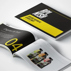
A clear layout makes your brochure easy to read and understand. A common layout for a bifold brochure is to have a cover panel, three inside panels, and a back panel. You can use one panel for headlines and images. The other panels can contain your key content.
Incorporate Engaging Illustrations
Illustrations are a powerful way to grab attention and explain complex ideas. They can also help to reinforce your brand identity. Consider using a mascot character or corporate mascot to represent your brand. This can make your brochure more memorable and engaging.
Use High-Quality Visuals
Whether you create illustrations yourself or hire a designer, make sure the visuals are high-quality. Low-quality or pixelated images can make your brochure look unprofessional. If you need to use stock illustrations, choose ones that align with your brand and messaging.
Balance Text and Visuals
While illustrations are important, you also need to balance them with text. Too many illustrations can make your brochure look cluttered and overwhelming. Too much text can make it look dense and unappealing. Aim for a balanced layout that allows both text and visuals to shine.
Incorporate Your Branding
Your brochure should reinforce your brand identity. Use your brand colors, fonts, and visual elements consistently throughout the design. This will help to create a cohesive and professional look.
Consider Paper and Printing
The type of paper you choose can impact the overall look and feel of your brochure. Thicker, glossy paper can make your illustrations pop. Matte paper can give a more natural, earthy feel. Think about how you will print your brochure too – digital or offset printing can affect the final quality.
Don’t Forget a Call-to-Action
Your brochure should have a clear purpose, whether it’s to generate leads, promote a product, or share information. Include a strong call-to-action that encourages readers to take the next step, such as visiting your website or contacting your business.
Utilize Negative Space Effectively
Negative space, or the empty areas around design elements, can be just as important as the content itself. Proper use of negative space can make your brochure look clean, organized, and easy to navigate. Too little negative space can make the design feel cluttered and overwhelming.
When incorporating illustrations, leave enough breathing room around them. Avoid cramming visuals and text too closely together. Negative space helps direct the reader’s eye and creates a natural flow through the content. Professionally designed fold brochures use negative space very coherently.
Carefully Select Colors
Color plays a crucial role in setting the tone and mood of your brochure design. Choose a color palette that aligns with your brand identity and complements your illustrations. Bright, bold colors can create an energetic, vibrant feel, while muted tones may convey a more sophisticated or earthy vibe.
Limit your palette to just a few main colors, plus neutrals like black, white, or gray. Too many colors can look busy and distracting. Consider how different colors may be perceived culturally as well, as color meanings can vary across audiences.
Emphasize Key Information
With limited space in a bifold format, you’ll want to strategically highlight the most important pieces of information. Use design elements like larger fonts, bold typefaces, and contrasting colors to draw the reader’s attention to crucial details.
Illustrations can also be used to emphasize key points. A striking visual next to an important statistic or benefit can make that information stand out and be more memorable.

Don’t Overdo Typography
While using multiple fonts can add visual interest, too much variation in typography can look cluttered and unprofessional. Stick to just two or three font families that complement each other and your brand style.
Reserve decorative or script fonts for headers or accents only. The body copy should be set in a clean, easy-to-read font. Ensure adequate spacing between lines and letters for optimal legibility as well.
Tell a Cohesive Story
Your bifold brochure design should tell a cohesive story that guides the reader through the content in a logical sequence. You can use illustrations to represent key sections or ideas within the broader narrative.
For example, one interior panel might showcase an illustrated process diagram. Another panel could depict benefits with icons or character vignettes. The cover and final panels should encapsulate the core concept or make a bold closing statement.
By designing an illustrated journey, you’ll keep readers engaged from start to finish while reinforcing your main messages. If you have a mascot company, having your company mascot in different poses throughout the bifold brochure will help retain attention.
If you’re looking for flyer design online or design stationary options, many companies offer templates or custom design services for bifold brochures or trifold brochure designs. Just be sure to follow these tips for an effective final product.
If you are looking for graphic design companies in Miami, we are here to help. The NetMen Corp offers affordable design services for small businesses. Whether it’s a postcard design, logo design, or affordable web design, we are ready to help you.
