PHONE: 1-888-519-3443
PHONE: 1-888-519-3443
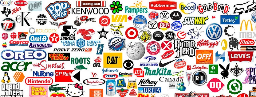
The most successful logos of all time are simple, memorable, flexible, and connected to a clear brand idea. Apple, Nike, McDonald’s, Coca-Cola, FedEx, Google, Starbucks, Mercedes-Benz, and Amazon all prove the same point: a logo becomes successful when people can recognize it instantly and associate it with a strong experience.
A successful logo does not need to explain everything a company does. It needs to be easy to remember, easy to use everywhere, and distinctive enough to separate the brand from competitors. The strongest logos keep working across packaging, websites, apps, storefronts, ads, social media, and merchandise.
Successful logos usually share five traits: they are simple, distinctive, scalable, relevant, and consistent. They work because the design is strong enough to remember and the brand uses it consistently for years. A logo gets more valuable when every customer touchpoint reinforces the same visual identity.
The Apple logo is simple but powerful. It’s just an apple with a bite taken out. But it’s known all over the world. The logo shows Apple’s love for simple design.
It works well on all their products. Many people think it’s one of the best logos ever made.
“Just Do It” and the Nike swoosh go hand in hand. The swoosh is simple and dynamic. It looks like movement, which is perfect for a sports brand.
Nike’s logo design services created something timeless. It’s been used since 1971 and still looks modern today.
The golden arches of McDonald’s are recognized everywhere. They form an “M” for McDonald’s. The bright yellow color stands out.
It makes people think of fast, tasty food. This logo is a key part of the company’s brand identity package.
Coca-Cola’s logo hasn’t changed much since 1886. Its flowing script is classic and elegant. The red and white colors are bold and eye-catching. This logo shows how a timeless design can last for over a century.
The three-pointed star of Mercedes-Benz stands for luxury. It’s simple but elegant. The logo represents the company’s goal to dominate land, sea, and air. It’s a perfect example of a successful corporate identity.
The FedEx logo has a clever hidden arrow between the “E” and “x”. This arrow suggests speed and precision. It’s a great example of smart design in a seemingly simple logo. Many logo design services try to copy this kind of clever trick.
Amazon’s logo has a smile that goes from “A” to “Z”. This shows they sell everything from A to Z. The smile also makes customers feel good. It’s a smart way to show what the company does and how it wants customers to feel.
The Starbucks mermaid is unique and memorable. It’s based on an old sailing image. The green color stands out and is now closely linked to coffee. This logo has become a global symbol for coffee culture.
Shell’s logo is simple but effective. It’s just a red and yellow shell shape. But it’s easy to spot from far away. This is important for a gas station. The bright colors catch your eye when you’re driving.
The Playboy bunny is known worldwide. It’s simple but full of meaning. The bow tie makes it look classy. This logo has become valuable on its own, beyond the magazine it represents.
These lessons apply to all kinds of logos. Whether it’s construction logos, real estate logos, or photography logos, the same rules can work.
For example, construction logos often use strong, solid shapes. They might include tools or building shapes. The colors are usually bold and strong.
Real estate logos often use house shapes or roof lines. They might use calming colors to make people feel at home. Some use luxury colors like gold for high-end properties.
Photography logos often play with camera shapes or lens imagery. They might use focus or framing in clever ways. Black and white are common colors, but some use bright colors to stand out.
When creating a logo, many businesses turn to professional logo design services. These experts know how to make a logo that really works. They can create a full brand identity package. This includes the logo, color scheme, fonts, and more.
Some companies need a rush logo. This means they need a logo very quickly. While it’s best to take time with logo design, sometimes you need to work fast. Even with a rush job, it’s important to follow the key rules of good logo design.
Many design companies have a logo portfolio. This shows examples of logos they’ve made before. Looking at a portfolio can help you choose the right designer for your needs.
Remember, a logo is more than just a pretty picture. It’s a key part of your brand identity. A great logo can help customers remember and trust your business. It can make your brand stand out in a crowded market.
The most successful logos of all time didn’t just happen by chance. They were carefully designed to represent their brands. They’ve stood the test of time and become famous worldwide.
Whether you’re a small business or a big corporation, your logo matters. It’s often the first thing people see about your brand. Make sure it sends the right message.
In the end, the best logos are those that represent their brands well. They’re simple, memorable, and meaningful. They work well in many different sizes and places. From business cards to billboards, a great logo always looks good.
So when you’re creating your logo, think big. Look at the most successful logos for inspiration. But make sure your logo is uniquely yours. With the right design, your logo could become the next classic.
The NetMen Corp creates custom logo design and brand identity systems built to work across websites, packaging, print, social media, and sales materials. Explore our logo design services or contact us to start your logo project.
Lorem ipsum dolor sit amet, consectetur adipiscing elit. Etiam aliquam iaculis purus eu facilisis. Quisque sit amet nunc non ipsum dapibus porttitor.
Lorem ipsum dolor sit amet, consectetur adipiscing elit. Etiam aliquam iaculis purus eu facilisis. Quisque sit amet nunc non ipsum dapibus porttitor.
Lorem ipsum dolor sit amet, consectetur adipiscing elit. Etiam aliquam iaculis purus eu facilisis. Quisque sit amet nunc non ipsum dapibus porttitor.