PHONE: 1-888-519-3443
PHONE: 1-888-519-3443
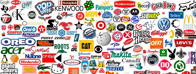
Logos are everywhere. We see them daily. But did you know many hide secret messages? Let’s explore some clever logo designs and their hidden meanings.
A logo is more than just a pretty picture. It’s the face of a brand. Good logo design services know this well. They create logos that stick in our minds.
Great logos are simple, yet meaningful. They capture a brand’s essence. The best logos often have hidden elements. These add depth to the design.
Even though your brand is a small business for now, you need to start thinking about getting a custom logo design.
Let’s dive deep into some well-known logos with clever hidden elements:
The FedEx logo is a masterclass in subtle design. Between the ‘E’ and ‘x’, there’s a hidden arrow pointing right. This arrow isn’t just a cute trick – it represents speed, precision, and forward motion. These are key qualities for a delivery company.
The arrow was created by designer Lindon Leader in 1994. It has won over 40 design awards, showing how powerful a simple, hidden element can be.
Look at the Amazon logo. See that yellow arrow? It does double duty. First, it points from ‘A’ to ‘Z’, showing that Amazon sells everything from A to Z. But look closer – the arrow also forms a smile. This smile represents customer satisfaction. It’s a promise that shopping with Amazon will make you happy.
The logo was designed by Turner Duckworth in 2000 and has remained unchanged since, proving its effectiveness.
Baskin Robbins is famous for its 31 flavors – one for each day of the month. Their logo cleverly incorporates this. The ‘BR’ initials contain the number ’31’ in pink.
This hidden number reinforces their brand identity and reminds customers of their wide variety. The logo was redesigned in 2006 by Sterling Brands, showing how a rebrand can highlight a company’s key features.
[logo toblerone . titulo: Toblerone Logo . Alt: The Toblerone logo has mountains]
The Toblerone logo features a mountain, representing the Swiss Alps where the chocolate is made. But there’s more – hidden in the mountain is the silhouette of a bear standing on its hind legs.
This bear represents Bern, Switzerland, where Toblerone was created. Bern is known as the ‘City of Bears’. This hidden element connects the brand to its hometown heritage.
Goodwill’s logo is a masterpiece of simplicity. The lowercase ‘g’ doubles as a smiling face. This hidden face represents the good they do and the happiness they bring to communities.
It’s a perfect representation of their mission to help people through the power of work. The logo was designed by Joseph Selame in 1968 and has stood the test of time.
At first glance, the Toyota logo might just look like stylized letters. But every part of it forms a ‘T’. It’s said to represent a thread in a needle, reflecting Toyota’s past in the textile industry before they started making cars.
The overlapping ovals symbolize the trust between the company and its customers. This logo, introduced in 1989, shows how a company can honor its history while looking to the future.
Cisco’s logo features a series of vertical lines above the company name. These aren’t random – they represent the Golden Gate Bridge in San Francisco, where the company was founded. This design element connects Cisco to its roots and the innovation of Silicon Valley. The logo has evolved since the company’s founding in 1984, but it has always maintained this connection to San Francisco.
The Tour de France logo is a clever play on words and images. Within the word ‘tour’, there’s a hidden cyclist. The ‘o’ forms the back wheel, the ‘u’ is the seat, and the ‘r’ creates the cyclist’s body and front wheel. This hidden image perfectly captures the essence of the world’s most famous cycling race.
The logo was designed by Joel Guenoun in 2002 and has become iconic in the world of sports.
These logos show how powerful hidden meanings can be. They make people look twice, help them remember the brand, and show that the company is clever and thoughtful. When you’re looking at logo design services or building your own corporate identity, consider how a hidden element might make your logo more memorable and meaningful.
A logo is just one part of brand identity. But it’s a crucial one. A brand identity package includes many elements:
All these work together to create a unified brand image. While having a logo is the first step towards building your brand identity, it is not enough.
When you hire a designer, you might get a logo design package. This usually includes:
A good package gives you everything you need to use your new logo. When choosing designers, make sure to check out their logo portfolios first. You will want to make sure that you are choosing someone whose style is in line with your expectations.
Different industries have different logo needs. Let’s look at two examples:
A real estate logo often includes:
These symbols instantly tell people what the business does.
Construction logos might use:
These images convey strength and skill.
Want to make a logo with a secret message? Here are some tips:
Logos with hidden meanings are fun. But they’re more than that. They:
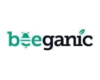
It’s not just big brands that use hidden meanings. Here are some lesser-known examples:
These logos show how hidden meanings can work for any brand.
As technology changes, so does logo design. We’re seeing more:
But the core idea stays the same: create a simple, memorable design that represents the brand.
Logo design is an art. Hidden meanings add an extra layer to this art. They make logos more than just pretty pictures. They make them puzzles to solve.
Next time you see a logo, look closer. You might find a hidden message. And if you’re creating a logo, think about adding your own secret. It’s a great way to make your brand stand out.
Remember, whether it’s a real estate logo, construction logos, or a rush logo, there’s always room for creativity. A good logo design service will help you find that perfect balance of simplicity and depth.
Your logo is your brand’s first hello. Make it count. Make it memorable. And maybe, just maybe, give it a little secret of its own.
Lorem ipsum dolor sit amet, consectetur adipiscing elit. Etiam aliquam iaculis purus eu facilisis. Quisque sit amet nunc non ipsum dapibus porttitor.
Lorem ipsum dolor sit amet, consectetur adipiscing elit. Etiam aliquam iaculis purus eu facilisis. Quisque sit amet nunc non ipsum dapibus porttitor.
Lorem ipsum dolor sit amet, consectetur adipiscing elit. Etiam aliquam iaculis purus eu facilisis. Quisque sit amet nunc non ipsum dapibus porttitor.